

Matthew Flores is an interdisciplinary artist and designer currently based in South
Carolina, where is is an
Assistant Professor of Graphic Design at Coastal Carolina University. His studio practice seeks to bridge the
gap between the discourse of design and the discourse of technology in order to articulate how each function as
interrelated tools for communication.
He is interested in: experimental forms of publication, alternatitive tools for making, HTML Energy, the differences between
simplicity and minimalism in design, hacking as an ethos, the power of mis-communication, neo-Luddism and
ethical forms of sabotage and resistance, Shaker work culture and how it can be applied to building the Internet, default design
aesthetics (including Prof. Dr.
Style and
yes, Times New Roman),
saying "that's bad UX" when something
annoys him, reclaiming obsolete technology, collecting monospace typefaces, and oxford cloth button downs.


No Soap, Radio
Radio Station, Website
(2022-Ongoing)
Listen Here↩
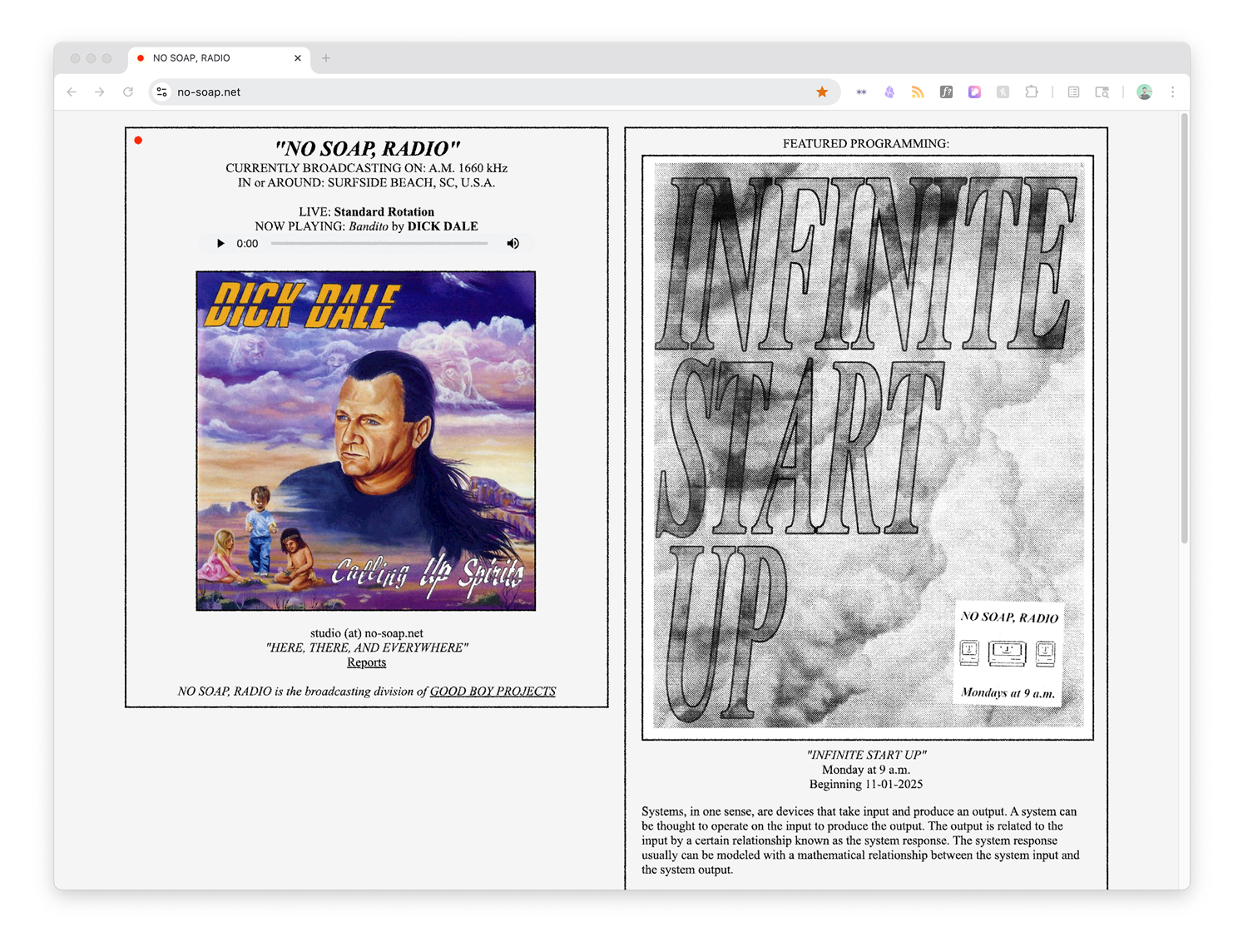
No Soap Radio is a modular, Part 15 AM radio station that treats broadcasting as both a
design medium and a physical system. Operating at the scale of a few square kilometers rather than a
city, the
project explores how transmission, reception, and limitation shape meaning and communication. By working
within the
constraints of Part 15 AM—low power, short range, and susceptibility to noise—No Soap Radio foregrounds
the
material conditions of radio: antennas as design objects, static as texture, and proximity as an
organizing principle. The station functions as a flexible platform for sound works, experimental
programming, and teaching, emphasizing radio as an intimate, local form of publication and
communication.
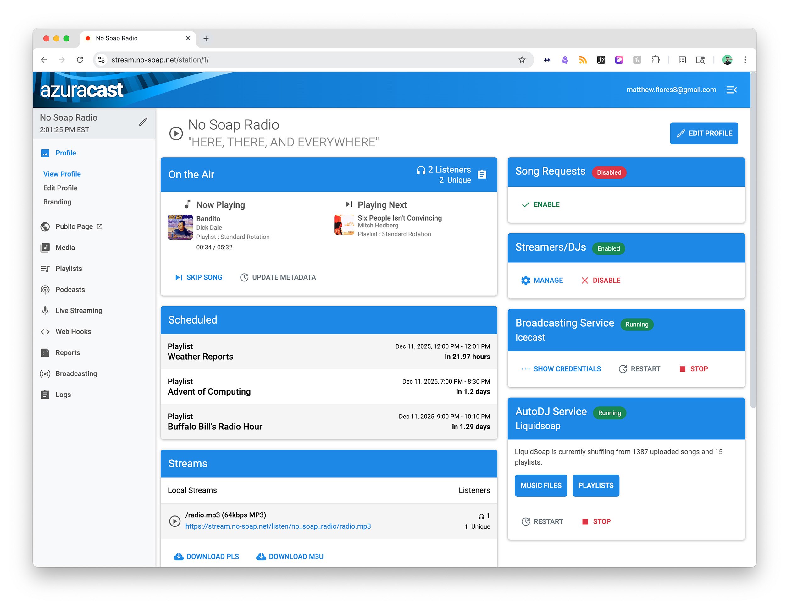
I designed and built a custom website for No Soap, Radio using
Kirby CMS and developed a fully self-hosted backend platform using AzuraCast, all running on a Raspberry
Pi 5 sitting on my desk.
100 Year Website
Website
(2024)
More Info↩
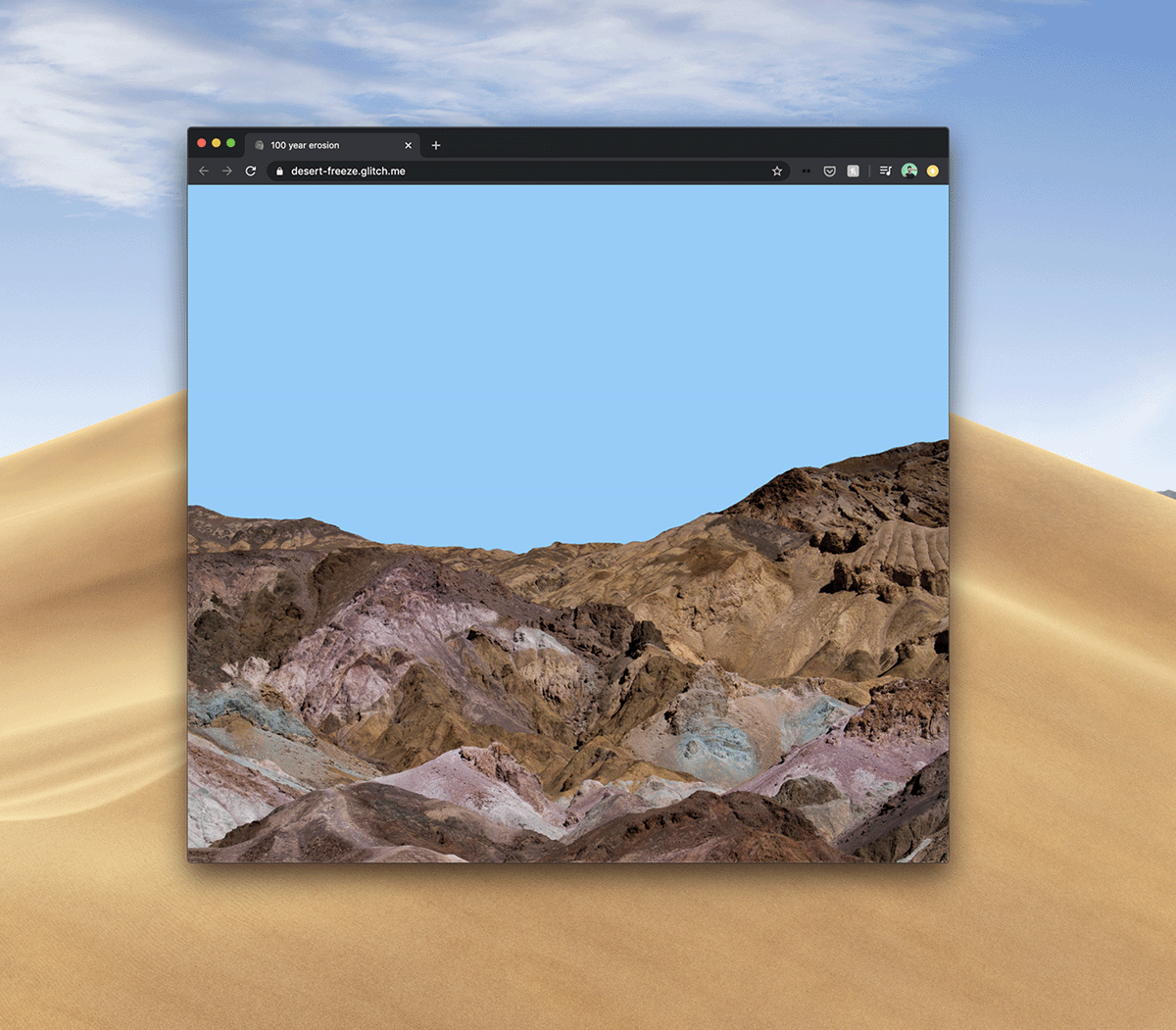
A simple gesture and meditation on the often delicate nature of websites, how links rot and don't come
back, the dozens of browser tabs I have open at any given moment, and how computers are just rocks we
taught to think.
100 Year Erosion is a website that's designed to slowly erode, turning the mountain to dust over 100
years - but only as long as the page is live in your browser.
All it takes is a single line of CSS!
 .mountain {
                    animation: fadeOut ease 3153600000s;
                    }
Bartelby
Livestream, Performance
(2024)
In December 2024, I was invited to participate in the @thing.tube NO-THING 24 hour livestream.
thing.tube is a peer-to-peer livestreaming platform and a form of software development as performance
art. By decentralizing streaming through a variety of low- and high-tech interventions, the project
offers an alternative to mainstream platforms like Twitch and YouTube, granting artists greater control
over their work and its distribution. This approach fosters direct interaction between creators and
visitors, without the mediation of conventional channels.
This livestream was organized around the theme of "nothing", so my contribution was to spend the day
coding a website with the full text of Herman Melville's "Bartelby, the Scrivener", taking requests from
the chat for CSS style tweaks.
Room-Sized Websites
ESP-32 Modules, Websites, Installation
(2025)
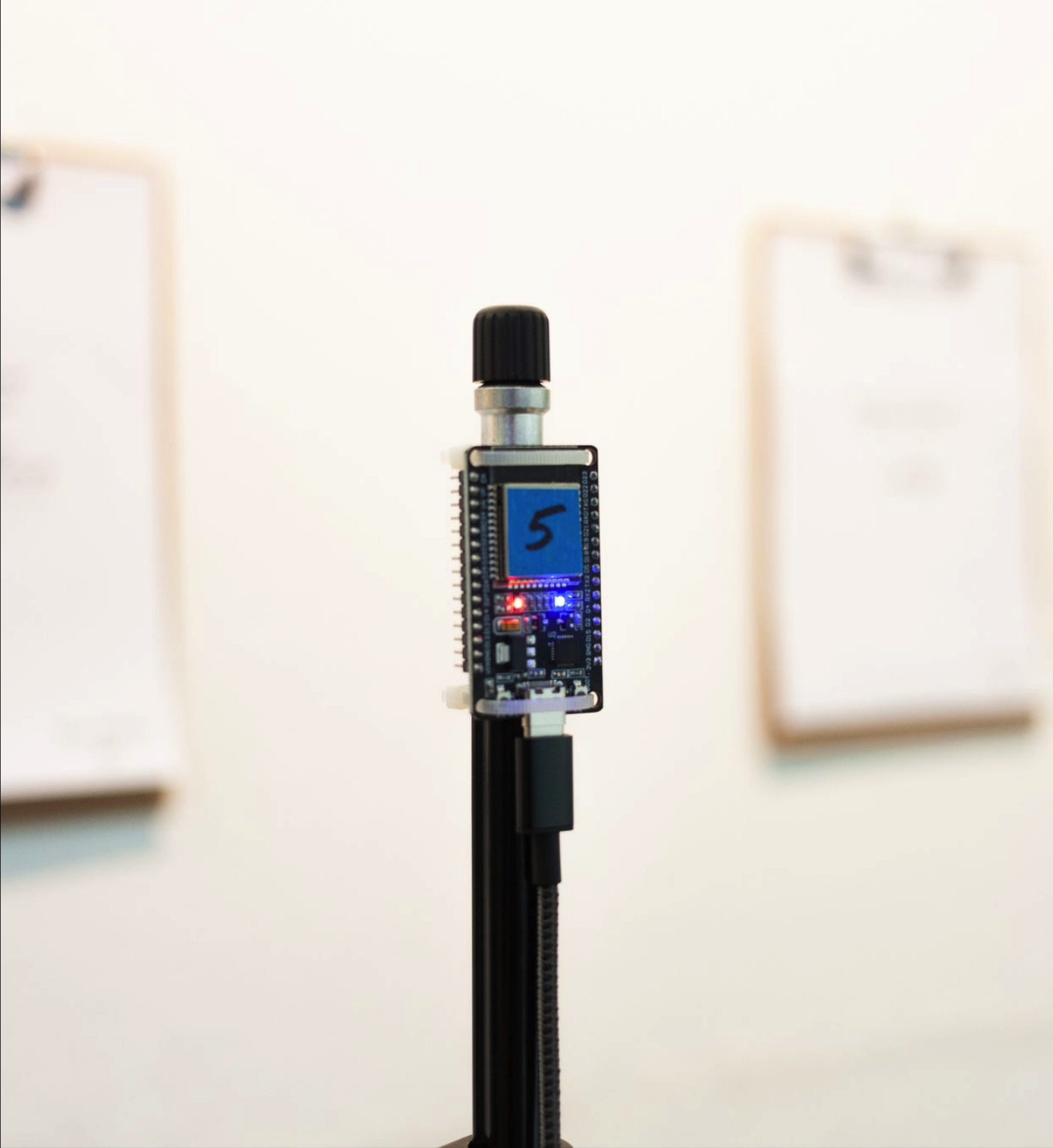
These room-sized websites reimagine the web as a spatial, embodied experience. Each site is custom-coded
and developed using a network of ESP-32 microcontrollers that create localized Wi-Fi access points using
captive portals. An ESP-32's signal only reaches a few dozen feet from each board, encouraging the
user's movement through
the room and making proximity, orientation, and chance part of the browsing experience.
The work explores ideas of narrowcasting, access, and scale, asking the user to consider what a website
becomes
when it is temporary, offline, and inseparable from a physical environment. By designing, developing,
and deploying both the hardware and software, I collapse distinctions between server, interface, and
exhibition architecture.
vols.design
Website, Class
(2025)
vols.design was a homepage for my GRDS 256 - Interaction Design classes at the University of
Tennessee-Knoxville School of Design. One of my goals when rebuilding this class was to teach students
how to build rich digital spaces and experiences with the simplest tools possible - in our instance,
vanilla HTML, CSS, and a little bit of JS.
As a demonstration, I built vols.design using these same tools and principles. It offered a
straightforward but powerful example that you don't need the latest (and often sluggish) front-end
frameworks to design a website.
RADIO FREE GRDS
Radio Station, Website, Class
(2025)
Listen Here↩
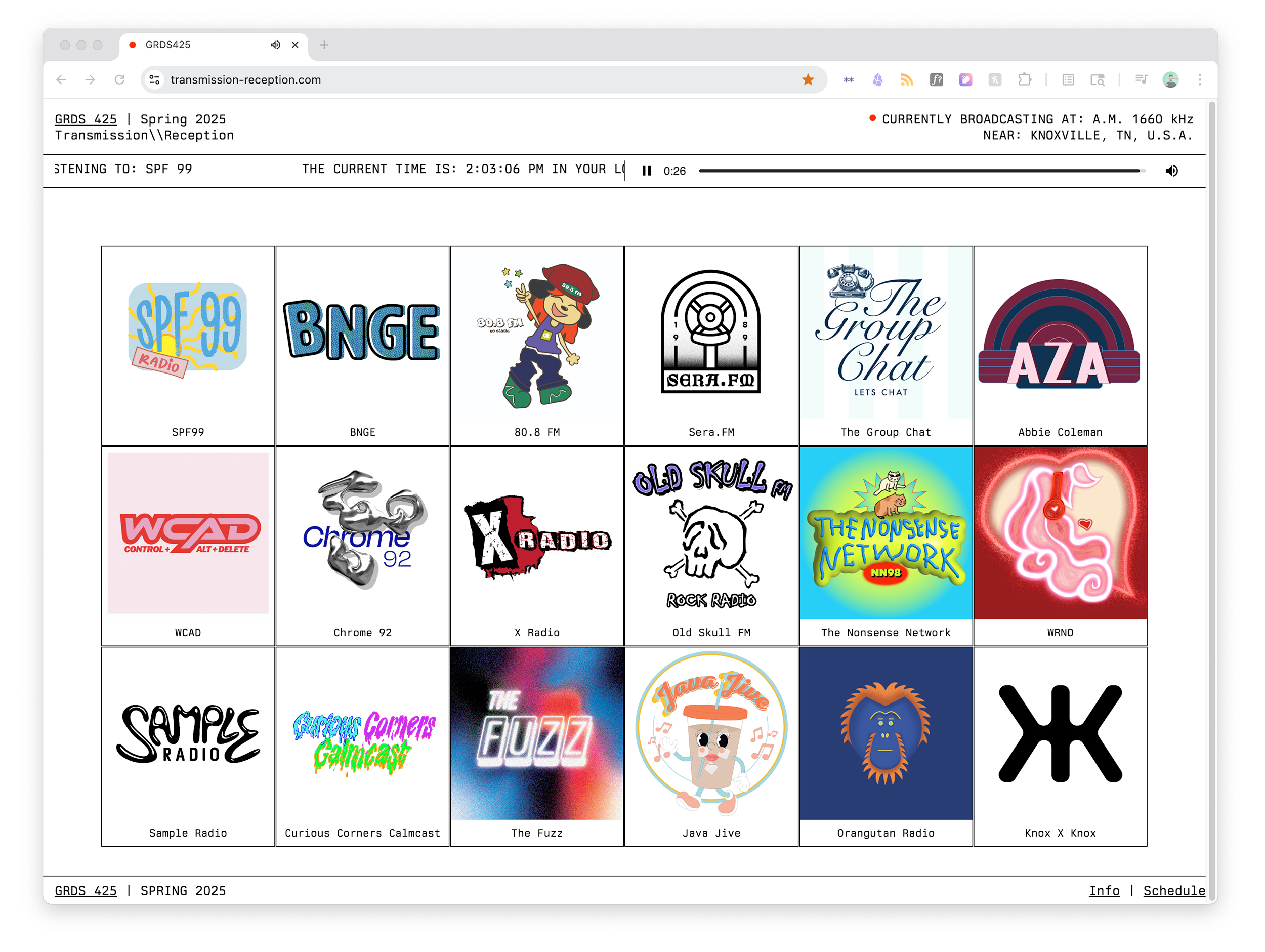
Transmission//Reception was a special topics course I taught at UTK in Spring 2025. In this studio,
students explored broadcasting through a variety of graphic forms, materials, and technologies. In
particular, students programmed and operated a Part 15 AM radio station transmitting both within the Art
+ Architecture building and streaming online.
RADIO FREE GRDS was an experiment in collaborative broadcasting, transmitted from the @utkschoolofdesign. The
signal is comprised of 18
individual stations, each with a unique programming strategy, aesthetic, and perspective.
Using the concept of broadcasting as a framework, students designed both physical (fliers, posters, and
beyond) and invisible (radio broadcasts, sound design, and performance) media that engage with and
complicate the act of communicating, while thinking critically about the importance of medium and
message in their work. We researched and pulled inspiration from moments of intervention and subversion
in public communication, with a special focus on underground, freeform, alternative, guerrilla, and
pirate forms.

Caesar's Palace Jump
576 pages, laser print on 8.5” x 11”, binder bound
(2024)
576 pages, laser print on letter size paper (the king of paper formats), binder-bound.
I spent much of 2024 finding ways to avoid using Adobe Creative Cloud software (I optimistically called
it "My Year of Alternative Tools") as both a protest against Adobe's increasingly pushy use of
generative AI, but also as a way to think through my process as a designer and user. Caesar's Palace
Jump in particular is an experiment in finding a complicated workaround in order to make a
simple book
layout.
Alternative tools workflow:
download video using semi-legal internet tools ➡️ extract frames using ffmpeg command line tool (I think
the command was something like ffmpeg -i knievel.mp4 -qscale:v 1
exported-frames/frame_%04d.png) ➡️
create the page layout using Finder and Keynote, adding page numbers and images ➡️ printing on the
mailroom Xerox (don’t tell the IT department)
I'm Feeling Lucky
Website
(2017-Current)
I’m Feeling Lucky is an experiment in direct-to-consumer art.
A viewer purchases an original print through Paypal, which triggers a series of automated server
processes - the code randomly selects an image from Google, applies a pre-made template (with my
signature), and sends the file to be printed and shipped. The customer doesn’t know what print they’re
buying until it arrives, and I never see what images ultimately are being sold with my signature
attached (really, I don’t want to see it. Please don’t tag me @matthewflores
with any purchased prints with my name on
them).
More Info↩
Finder Jürgen
Image Files, Finder Window
(2025)
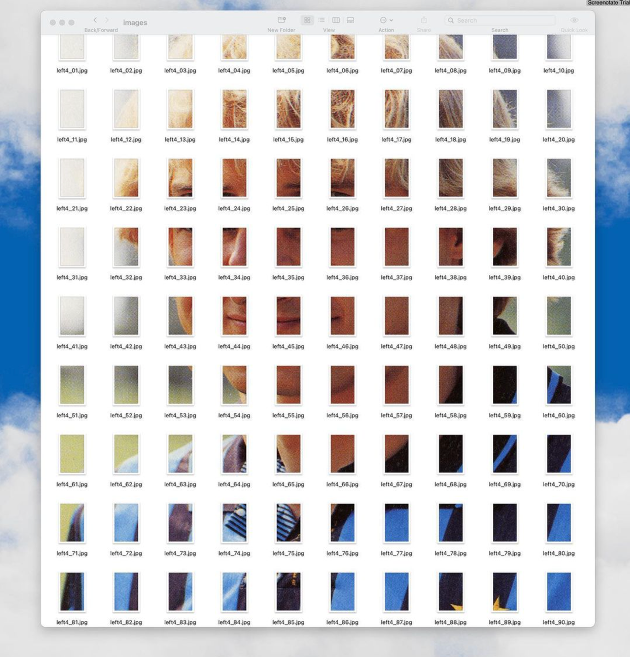
Finder Jürgen is an experiment in alternative publishing that asks whether a book can be laid out and
read within a Finder window.
Rather than a fixed sequence of pages, the publication exists as a live,
ephemeral system: files, folders, and metadata become typographic and structural elements. The content
continuously changes in response to how the user resizes, sorts, opens, and navigates the window, making
interaction an integral part of reading. By treating the operating system interface as simultaneously a
medium and
a layout tool, the project reframes publishing as a dynamic, user-driven process rather than a static
object.
PROCESSING/CREATIVE CODING
Image Files, Finder Window
(2024-Ongoing)
As part of My Year of Alternative Tools, I've been experimenting with Processing and p5.js to
code graphics as a way of
stepping outside commercial design software and returning to a more intuitive way of making.
Writing code to generate form forced me to think about process over polish, and how to embrace
variability,
constraint, and imperfection as design values. What happens when I focus on play and experiment rather
than the dreaded "deliverable"?
PASTE-UP HELPER
Web Application
(2025)
I like to bridge between very digital and very analog ways of making in the studio - lately, this means
designing flyers and print projects using a traditional paste-up layout technique.
A major pain point of this method is setting and resetting text and images in different sizes - so I put
together a very quick and very rough helper to make it go a little faster and smoother.
Paste-Up Helper lets you add text/images, select your font (more coming soon!), choose some sizing
options, and export to .PDF for printing and cutting and pasting! All built in a basic browser app with
vanilla HTML/CSS/JS.
It's important to make your own tools, even if they're coarse and janky!
CERNE ABBAS GIANT.PDF
Modified PDF File
(2025)
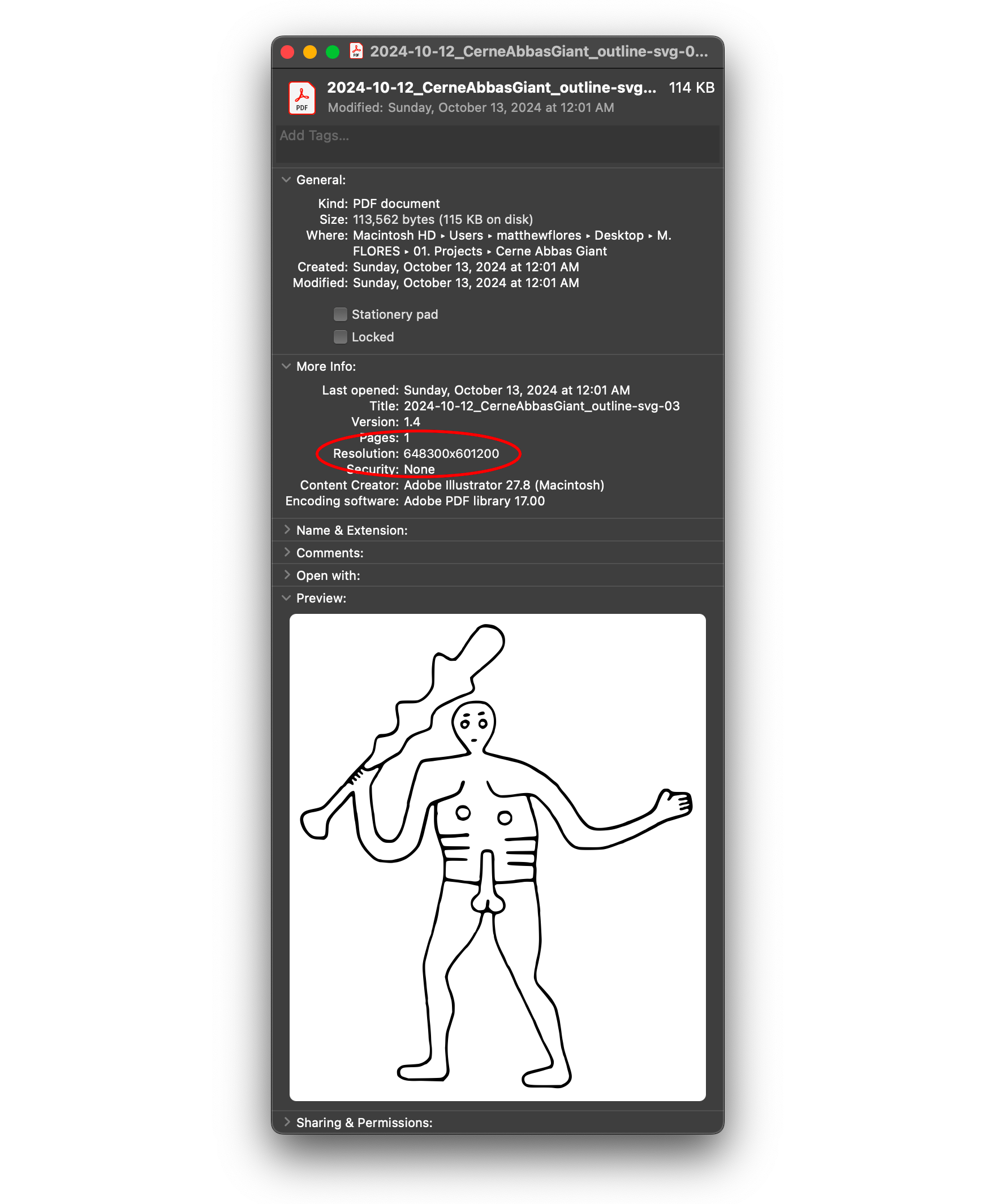
Quick: what’s the maximum allowed dimensions of a PDF file? Any guesses? I’ll wait.
Answer: 15 million inches by 15 million inches or about 381 km2.
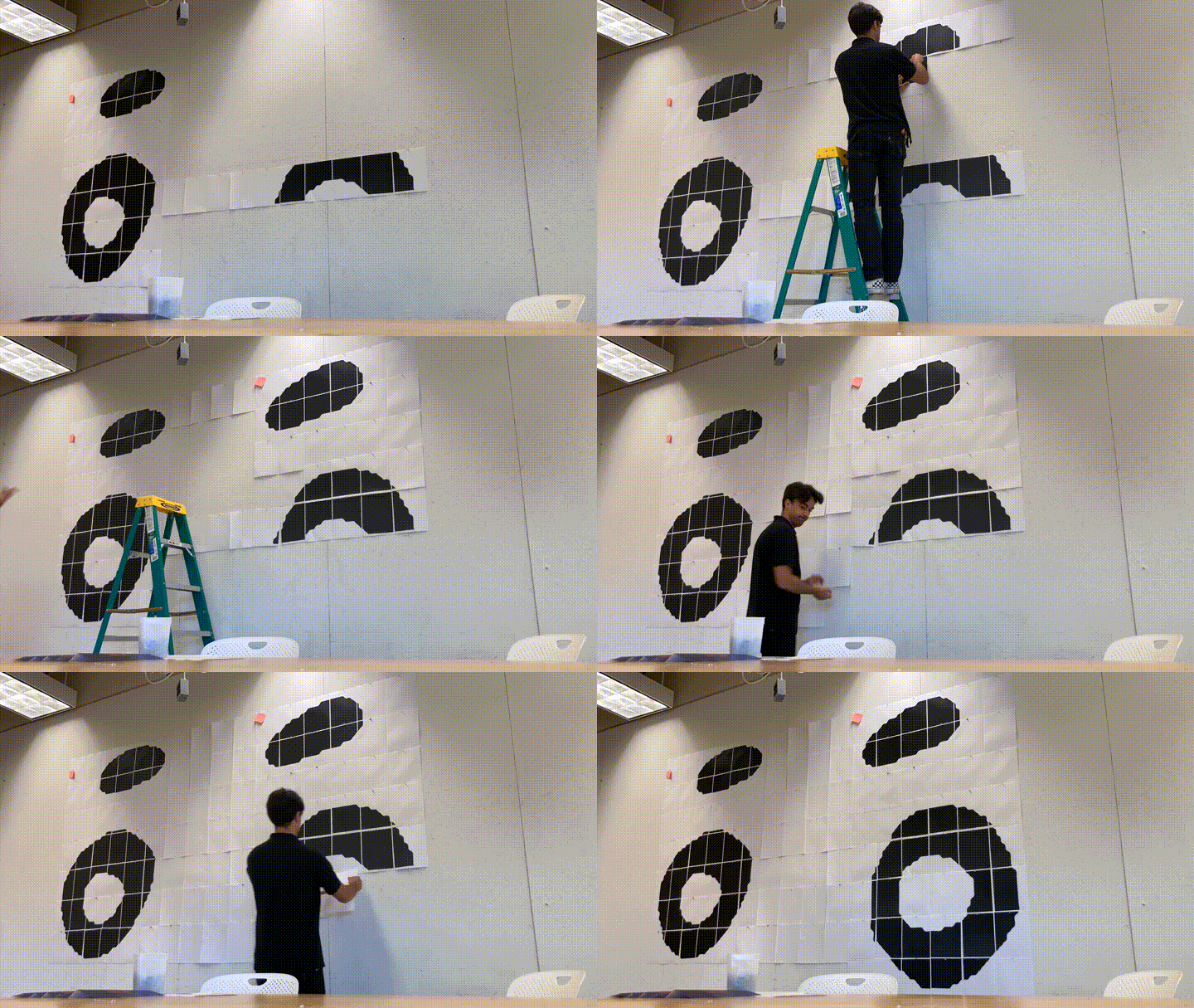
I thought this was a very funny but also very real limitation, so I looked for a reasonably funny image
to display at its maximum size. I landed on an actual size PDF of the Cerne Abbas Giant, a (semi) famous
example of pseudo-indigenous land art in Dorset, England.
Naturally, I had to print it out to test (again, please don’t tell the IT department I used a staff
printer).
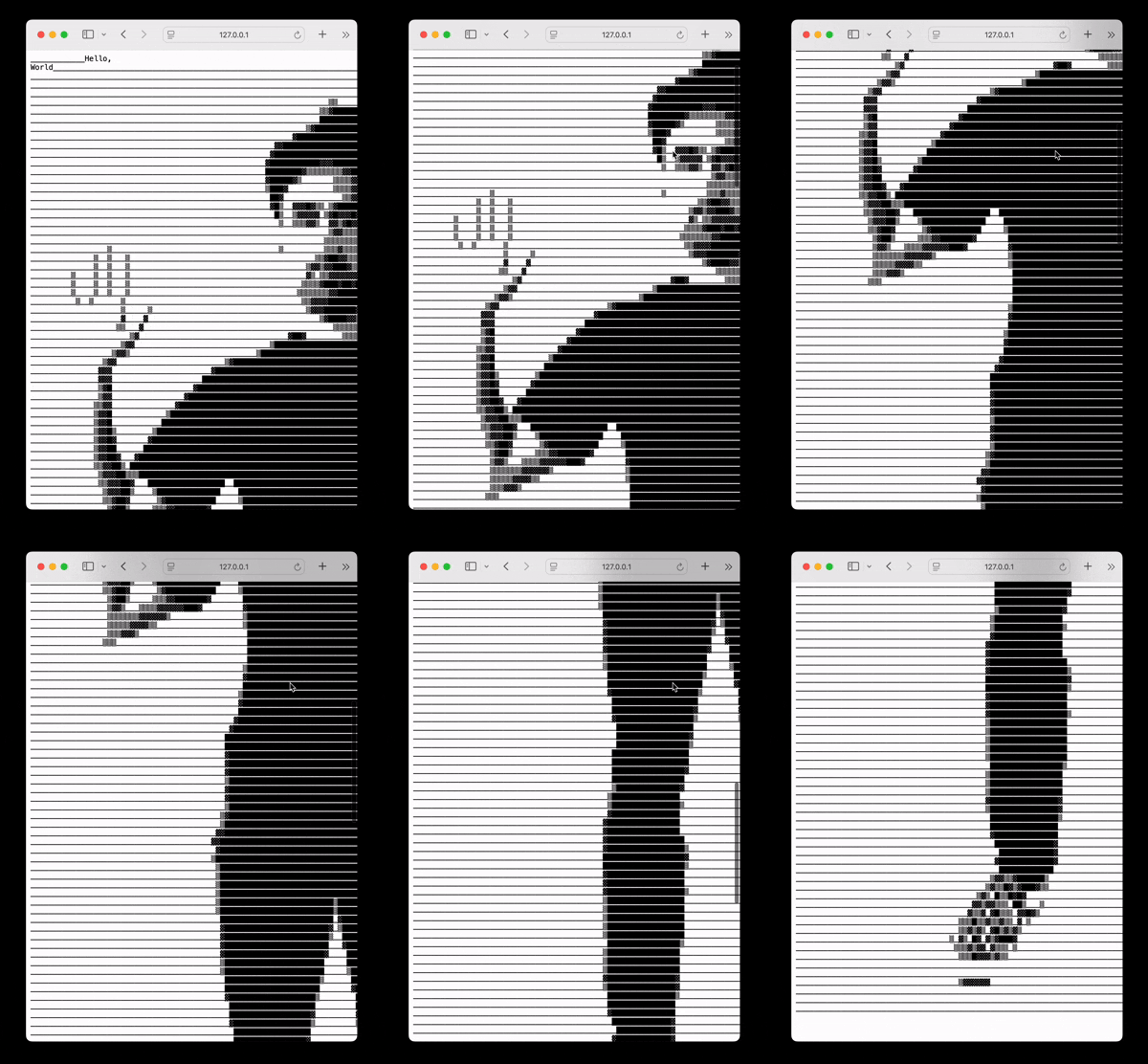
Hello, World
Radiofax transmission, 44:25 min.
Published as 90 minute cassette
(2025)
Listen here:
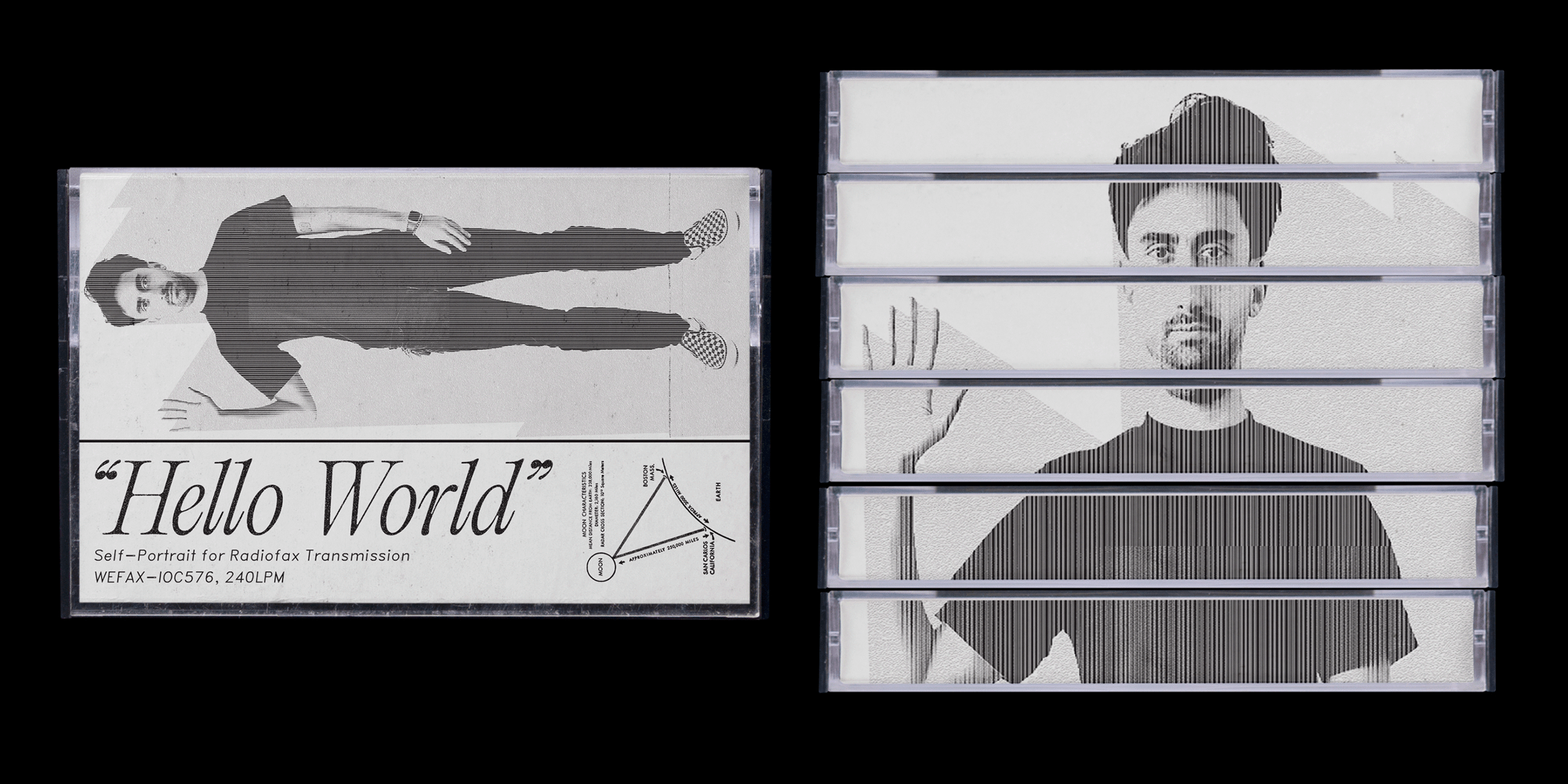
As a radio enthusiast and someday Ham Radio Operator (I'm going to take the exam soon, I promise!), much
of my time in the studio is finding ways to compare radio technology with visual design, and to see how
each can tell us something about the nature of communication.
A particularly niche activity in the Ham world is EME Moonbounce, where you use the Moon itself as a
giant reflector dish, bouncing your signal to the other side of the globe. I always wanted to go to the
Moon, so I made a self-portrait, encoded it into a format for radio fax transmission (it sounds a little
like dial-up), and recorded it to cassette for a future moon bounce transmission.

Who's on First?
Poster
24" x 36"
(2024)
I designed this poster using Hellschreiber (a very antiquated protocol for radio) transmissions of
Abbott and Costello's "Who's on First?"
routine. I sent each line of the script to myself over shortwave radio, letting atmospheric noise and
signal drift corrupt the text into visual static.
The Hellschreiber's mechanical printing method turns
each miscommunication into literal marks on paper: garbled names, dropped words, and interference
patterns that mirror the confusion in the original sketch. The poster uses these transmission artifacts
as their primary typography, where "What" becomes visual noise and "I Don't Know" disintegrates into
pixel scatter. Static isn't a bug here but the actual design language, making the medium perform the
same breakdowns as the comedy routine it carries.
Information-As-Thing
Fax Performance, Installation
Dimensions Variable
(2025)
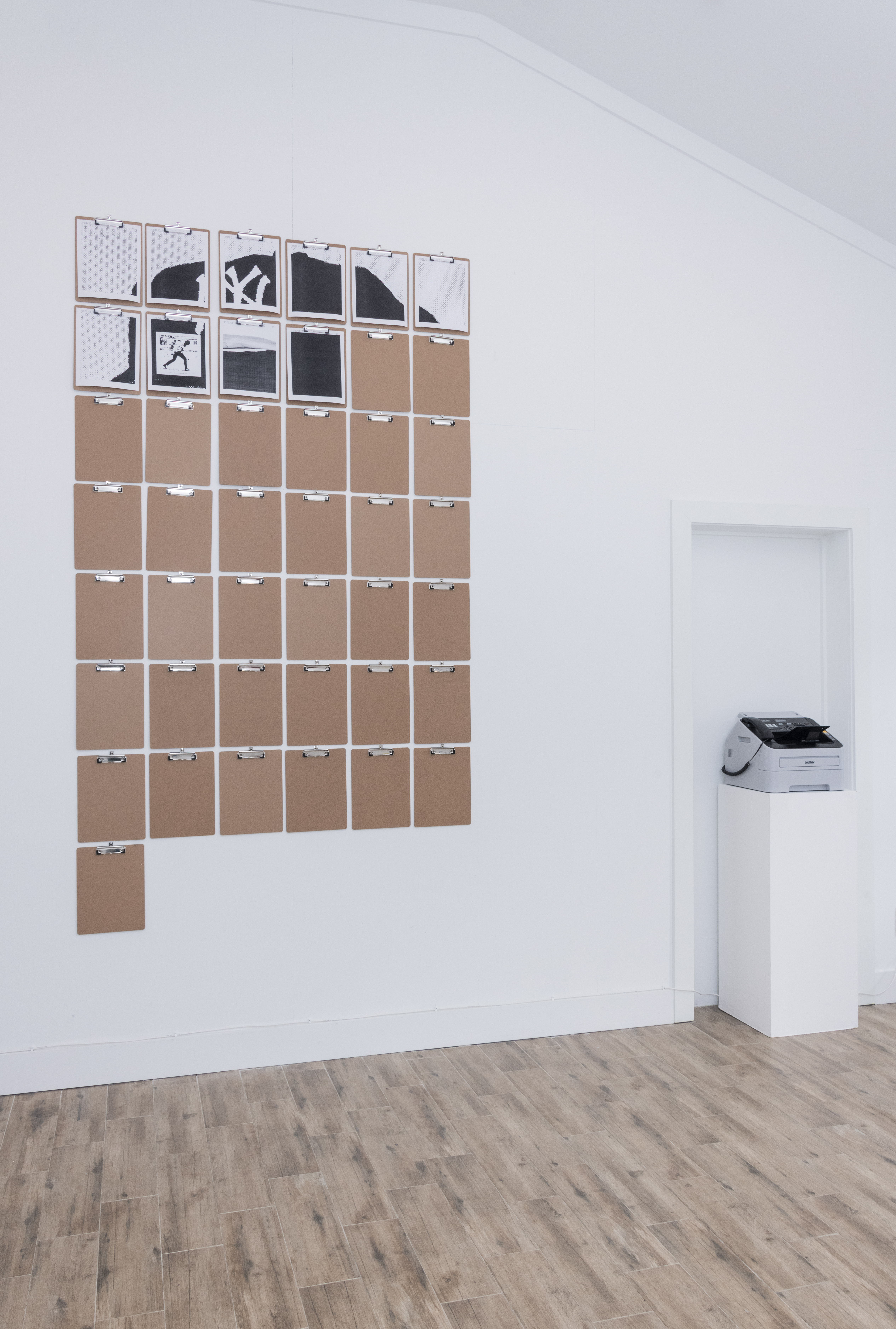
During my solo show, You're the Man Now, Dog, at Cleo in Savannah, Georgia, I would send daily fax
transmissions at a fixed time, building an installation piece
by piece over the exhibition's run. I installed clipboards to hold the daily print, creating a growing
archive of thermal paper artifacts.
The
work operates on multiple temporalities: the slow accumulation of the installation itself, the brief
mechanical event of each transmission, and the chance encounter of being present when the fax machine
activates. Visitors who showed up at the right moment witnessed the performance aspect, while others saw
only its residue.
I'm very interested in fax technology's particular qualities (its line-by-line rendering,
relative slowness, and transmission errors), and this is an attempt to reclaim the weridness of fax as
both medium and subject, turning the obsolescence of
telecommunication hardware into a gallery event that unfolds whether anyone's watching or not.

I Was Trying to Describe You to Someone (Funny Fone)
Coin-Operated Joke Machine
12” x 12” x 18”
(2024)
Jokes are a terribly intimate form of communication, even if we tend to resist thinking of them in that
way. These Funny Fones used to exist more firmly in the context of how we communicate with each other on
a daily basis - maybe you remember seeing one in an arcade, or a bowling alley, or at the end of a bank
of payphone.
I repurposed an original Funny Fone and filled it with custom electronics (Arduino, mostly) and code so
that instead of playing you a joke, when you pay a quarter it plays an audio telling of Richard
Brautigan’s “I Was Trying to
Describe You to Someone.” The catch: some of the recordings are performed
by a human, others by an AI deepfake.
Each playback asks whether the voice delivering these
lines changes their meaning, whether intimacy survives algorithmic speech, and what happens when you try
to make something as private as describing someone you care about a transaction.
Heaven
Prayer box, Custom Electronics
3.5" x 2" x 1"
(2023)
I wanted to learn how to design and manufacture (have manufactured, I suppose) PCBs, so I used
a very simple box that plays Buddhist prayer songs on loop, and added my own circuitry so that it played
a slowed down, choir version of the Talking Heads "Heaven".
GEORGIA PUBLIC BROADCASTING
Design, Front-End Development, User Experience
(2019-2023)
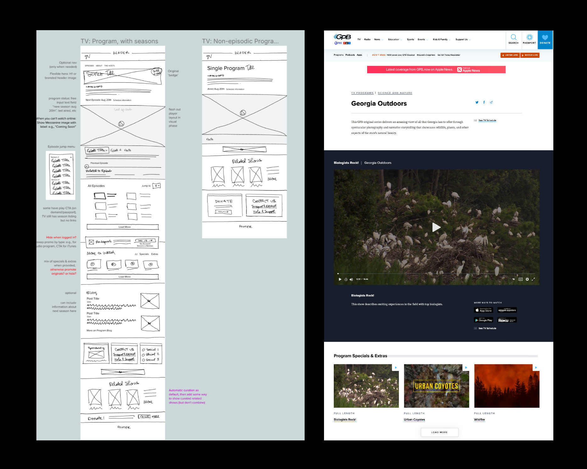
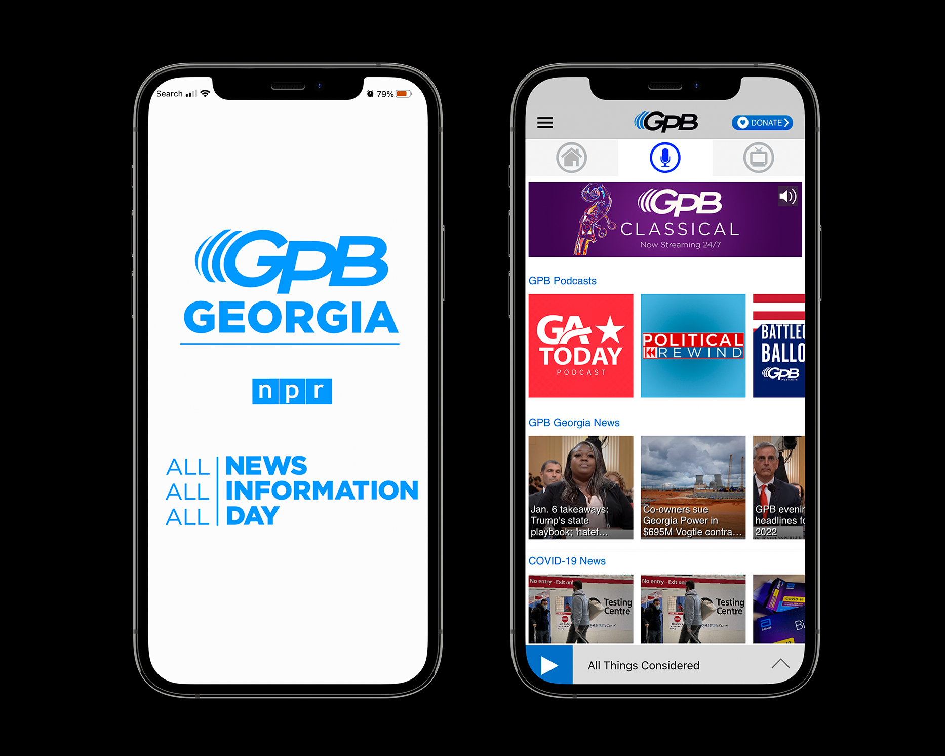
As a UX/UI Designer and Front-End Developer at Georgia Public Broadcasting, I led the effort to rethink
and redesign the organization’s digital presence across web and mobile platforms. Working within a
public media context, I focused on clarity, accessibility, and editorial structure, ensuring that our
news,
education, and cultural programming verticals were easy to discover and engaging to navigate. I
collaborated
closely with the newsroom, engineering, and product teams to translate a complex content ecosystem into
coherent user experiences, balancing the needs of diverse audiences with the constraints of legacy
systems and public media standards.
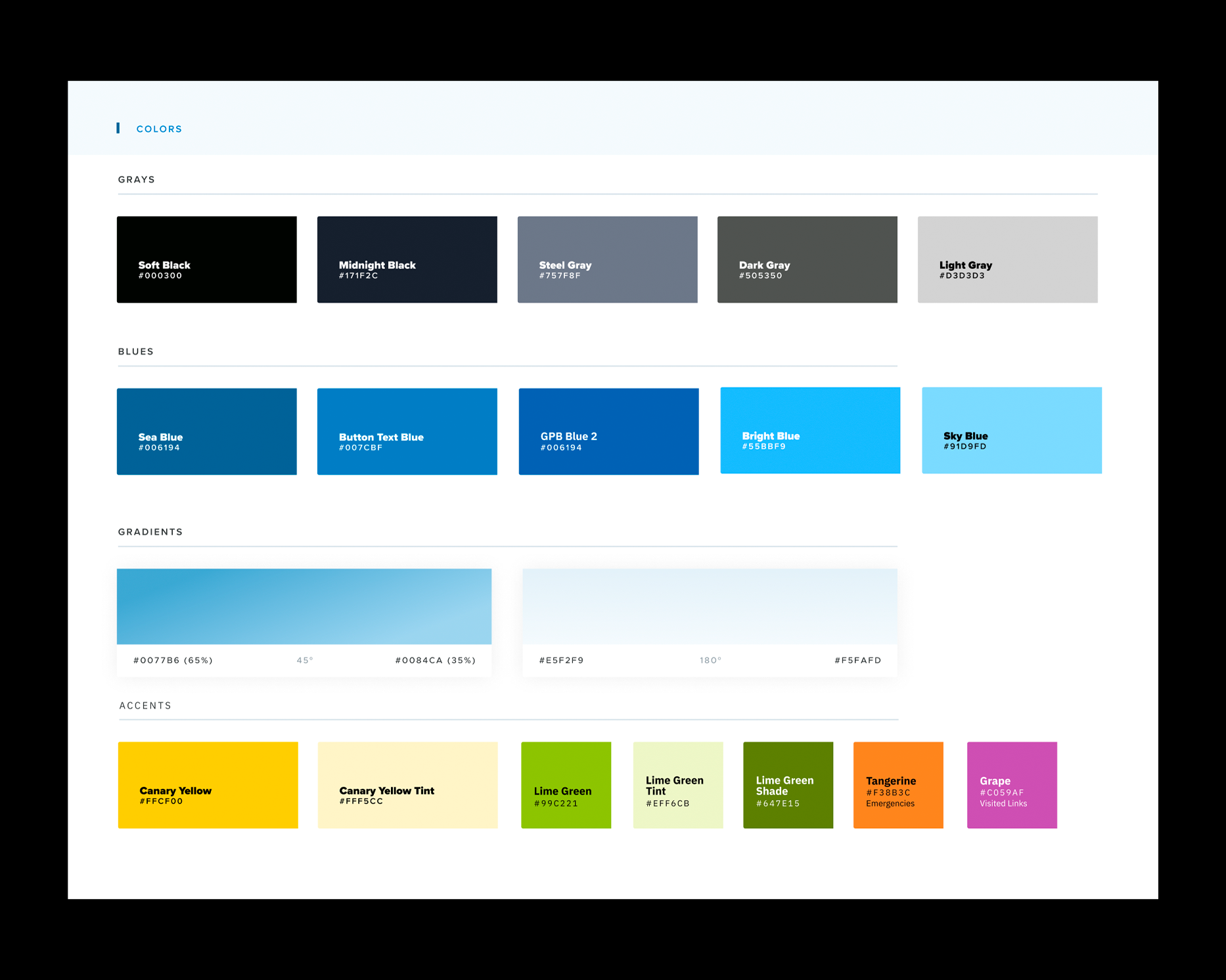
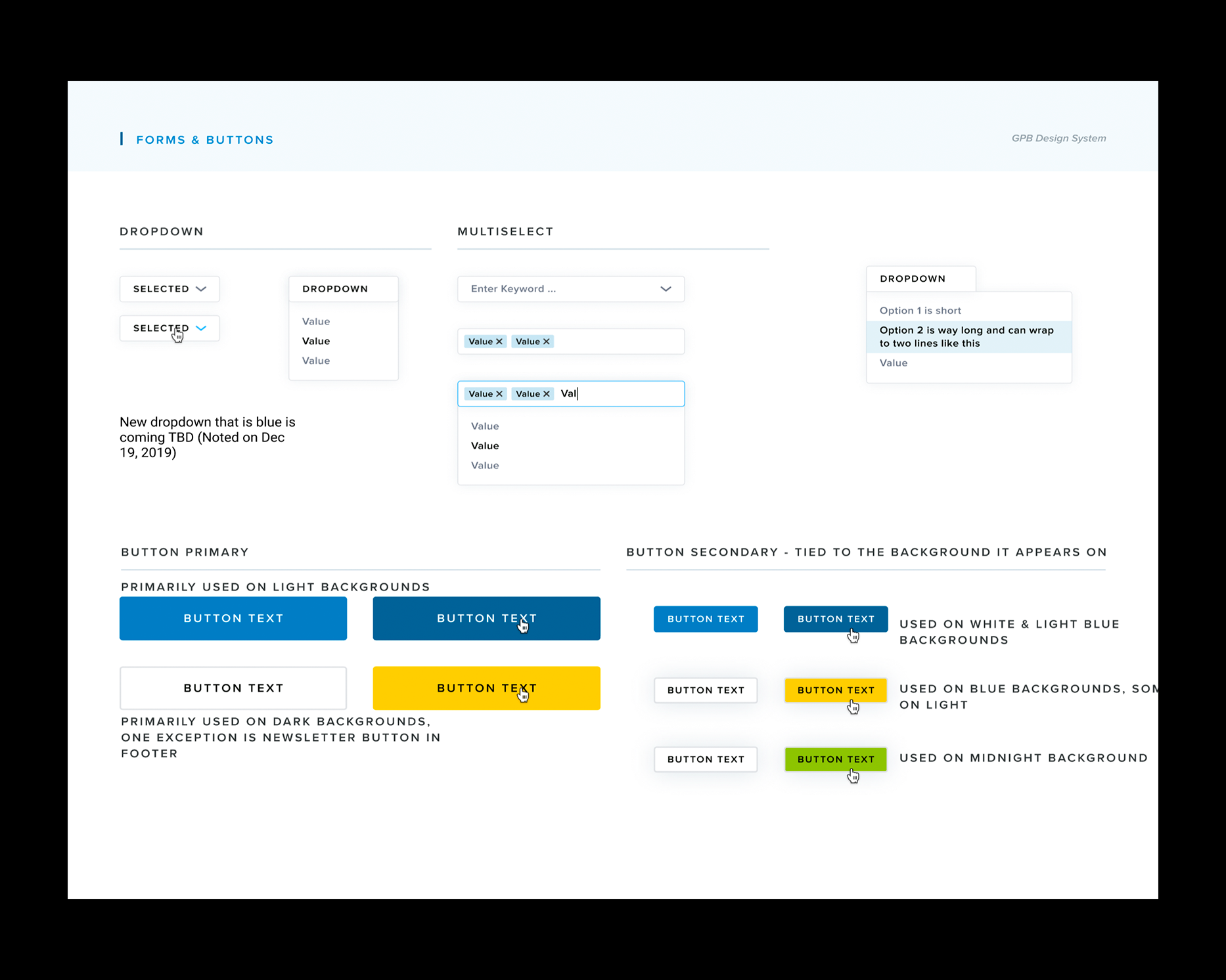
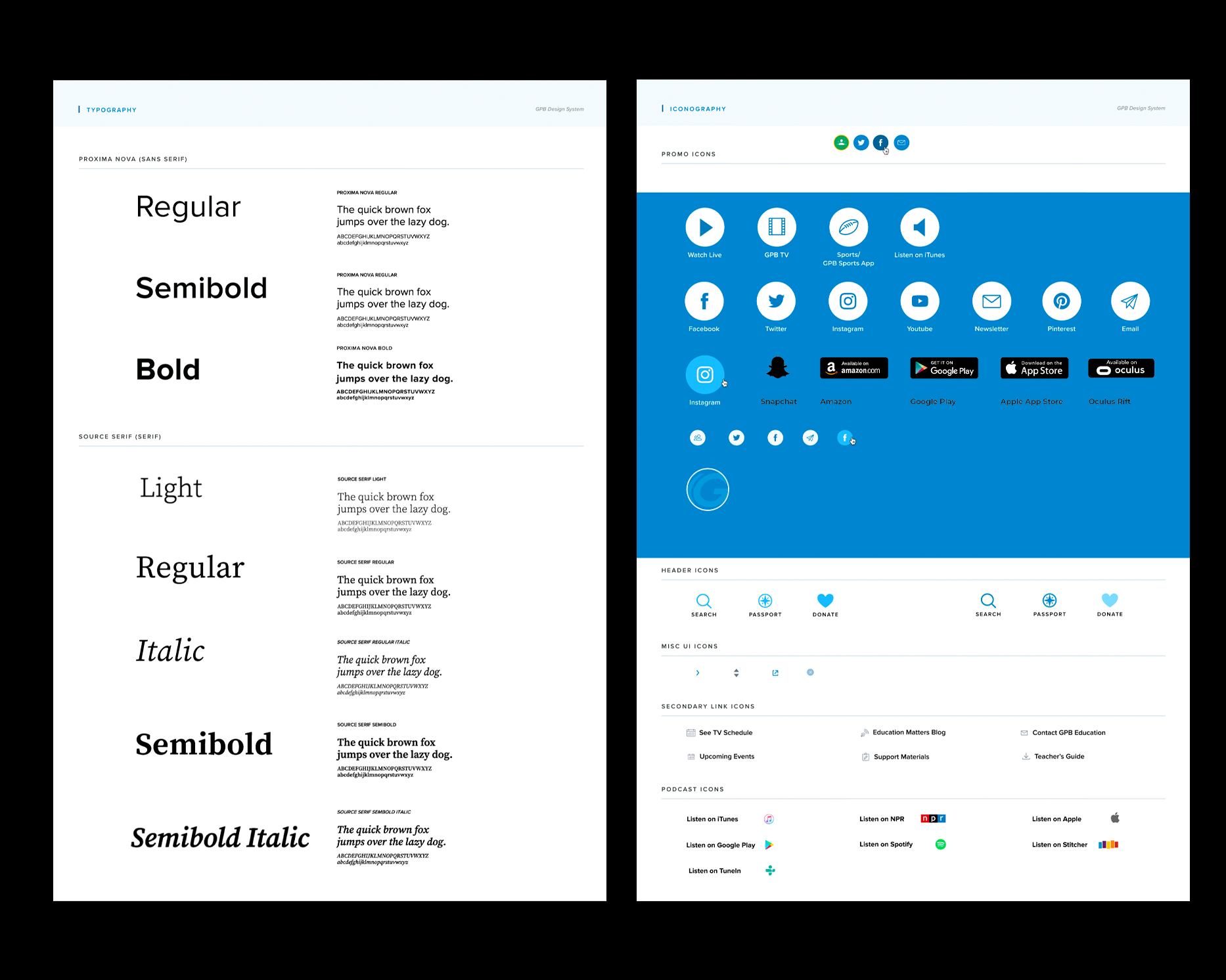
I spearheaded a complete redesign of GPB’s Drupal-based website and companion app, designing and
developing user-facing
systems that were flexible, scalable, and responsive across devices. This included establishing design
patterns, refining navigation and information architecture, and implementing component-based interfaces
that could support ongoing growth. By aligning visual design, UX strategy, and front-end development,
the redesign modernized GPB’s digital identity while improving performance, usability, and long-term
maintainability.
GPB Education
Design, Front-End Development, User Experience
(2019-2023)
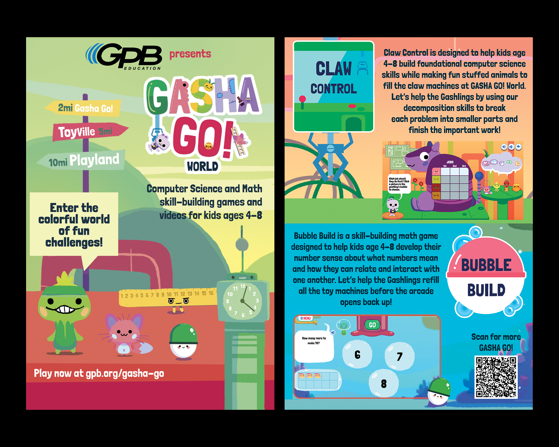
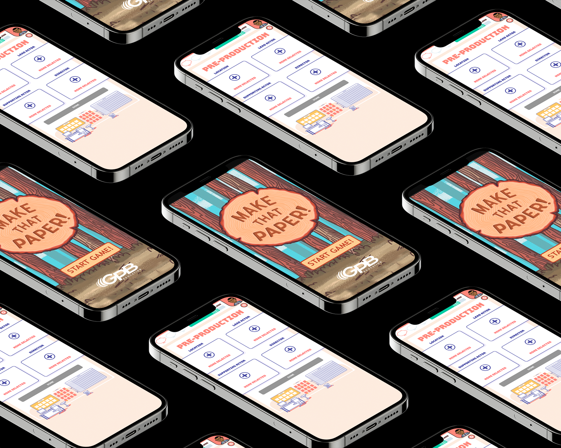
As a Designer for GPB Education, I focused on creating engaging, age-appropriate digital experiences for
K–5 students across the state of Georgia. My work centered on the design of a suite of educational games
and interactive software that aligned with state curriculum standards while remaining playful,
intuitive, and accessible for young learners. I collaborated with educators, curriculum specialists, and
developers to translate learning objectives into clear visual systems, interaction patterns, and game
mechanics that supported exploration and discovery.
Across these projects, I emphasized usability and inclusivity—designing interfaces that
could be easily understood by early readers, accommodate a wide range of abilities, and perform reliably
in classroom environments with varying levels of technology access. I developed visual systems, UI
components, and interaction flows that balanced fun with instructional clarity, ensuring that the
games functioned as both an educational tool and an inviting entry point to digital learning. This
work contributed to a statewide platform that supported teachers, engaged students, and extended public
education through thoughtfully designed interactive media.
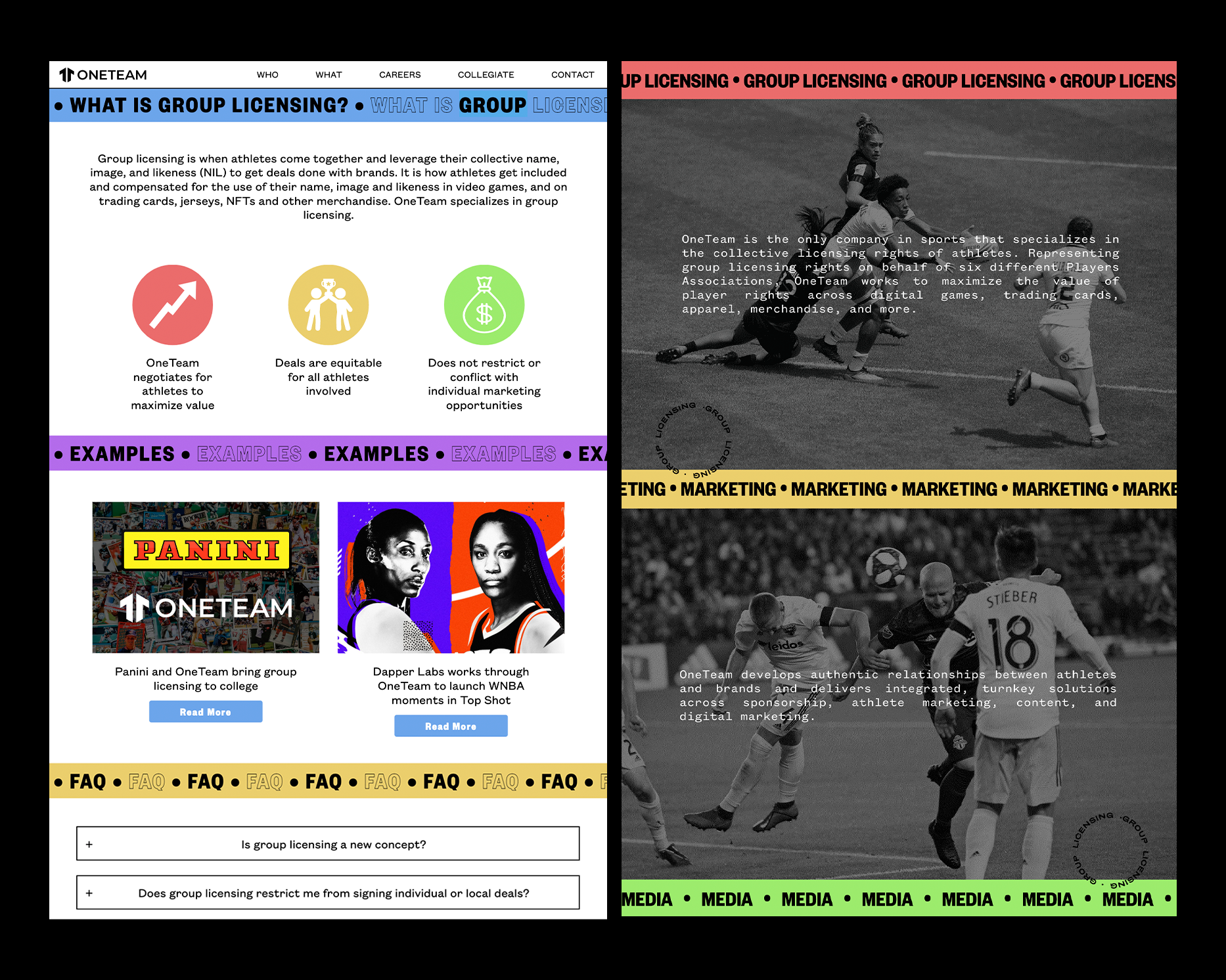
ONETEAM PARTNERS
Website Design & Development
(2022)
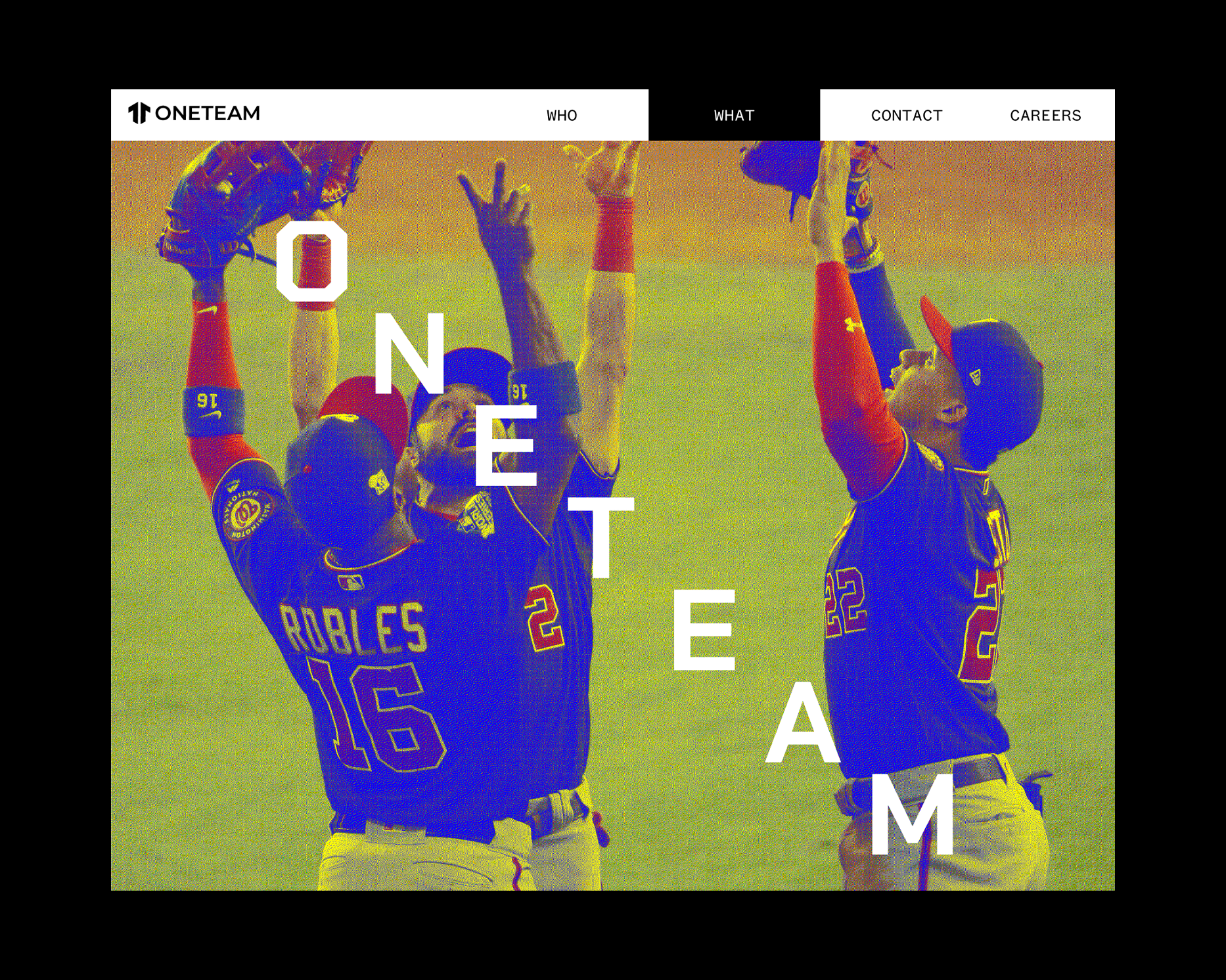
Website design and development for OneTeam Partners, a pioneer in the Name, Image, Likeness sports
market.
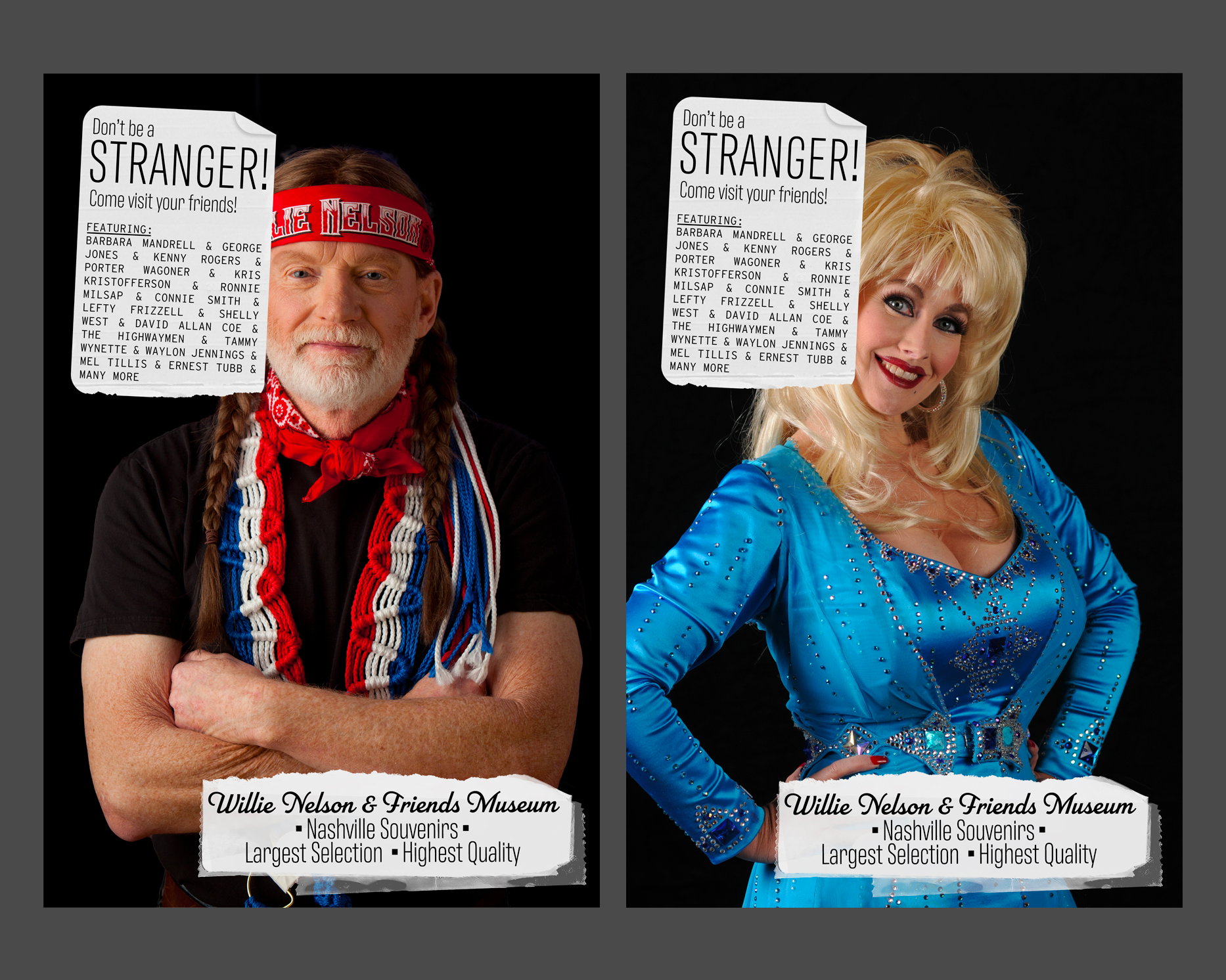
Willie Nelson & Friends Museum
Poster
24" x 36" each
(2019)
Poster campaign for the Willie Nelson & Friend Museum in Nashville, Tennessee.
Project: App Design
GRDS 256 - Interaction Design
UTK School of Design
Description:
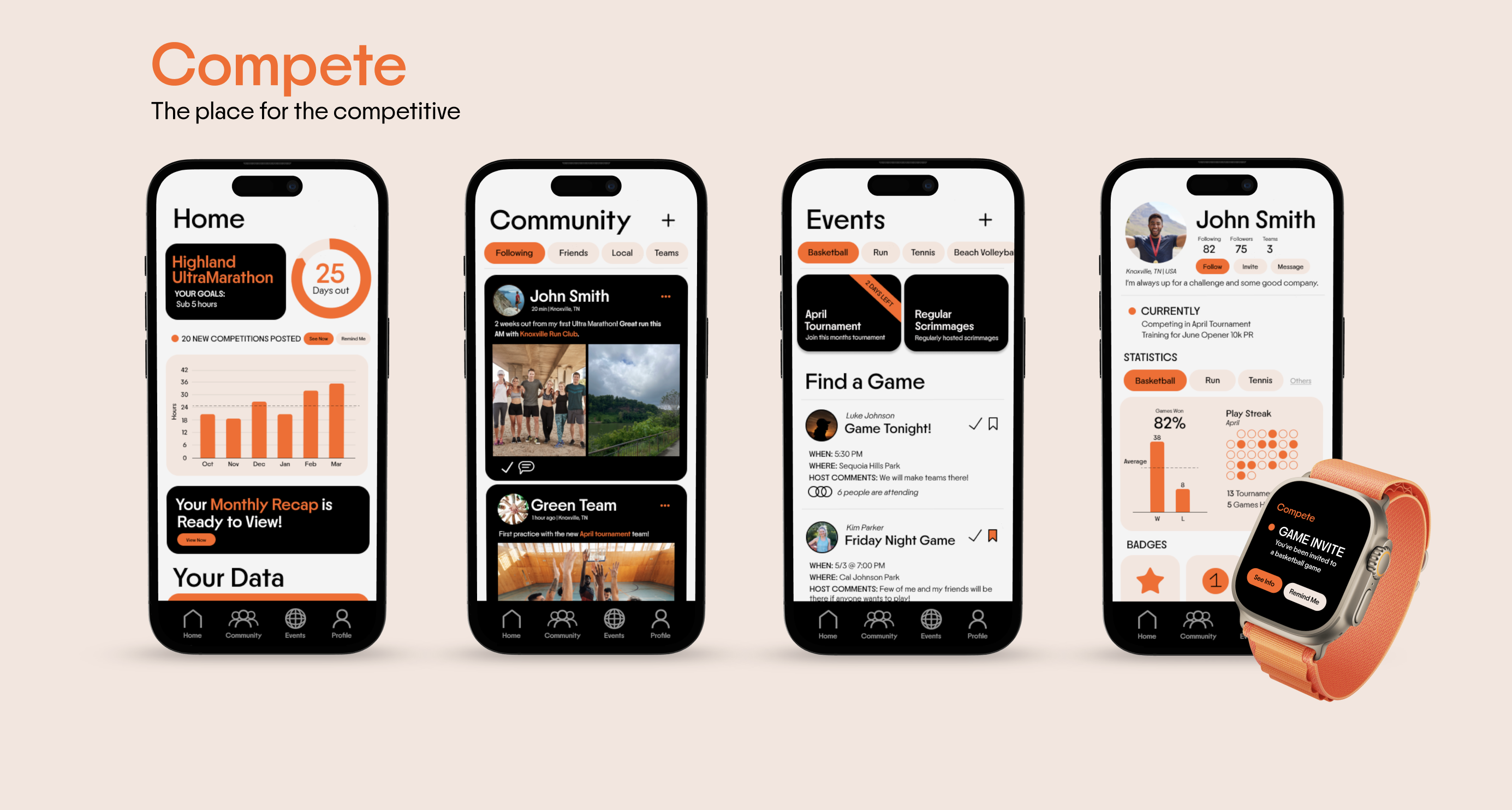
For this assignment you will create an app from the content of ten linked Wikipedia entries. Everyone
will start from the same place: the Wikipedia entry for Interaction Design. From within this entry you
will choose a word or phrase which is hyperlinked to another Wikipedia entry, and collect the main
column text for that term. From this second term you will choose another hyperlinked term, and so on,
for 10 terms. (As an example, I collected the following string: interaction design, Muriel Cooper,
SX-70, Mylar, sailboat, paddle, yacht, etc.)
The link chain you create will guide the user flow in your app design. Starting from a splash page, you
will design an experience that takes a user from the start through the end of your chain. Consider user
flow, navigation standards, and the constraints of the mobile device in your design.
Objectives:
→ Create a working prototype of a mobile app, fore fronting user flow and linked
content.
→ Consider narrative structures as generative structures.
→ Identify best practices in user navigation.
Tools & Skills:
Figma, Wireframing, User Research, Persona Mapping, Prototyping, Animation, User Flow
Project: PYOP (Propose Your Own Project)
GRDS 256 - Interaction Design
UTK School of Design
For your final project, you are tasked with conceptualizing, pitching, and
designing a digital project of your choice. This is intentionally open-ended, as
to give you the opportunity to apply and synthesize everything you’ve
learned and been curious about this semester into an experience or design
you’d like to see exist. Be weird! Take some chances!
Objectives:
→ Practice ideation and idea generation.
→ Prepare and deliver a professional pitch presentation.
→ Integrate research into a comprehensive design system.
Tools & Skills:
Figma, Wireframing, User Research, Persona Mapping, Prototyping, Animation, User Flow, Pitch and
Presentation Design
Project: Radio as Publication
GRDS 425 - Transmission//Reception
UTK School of Design
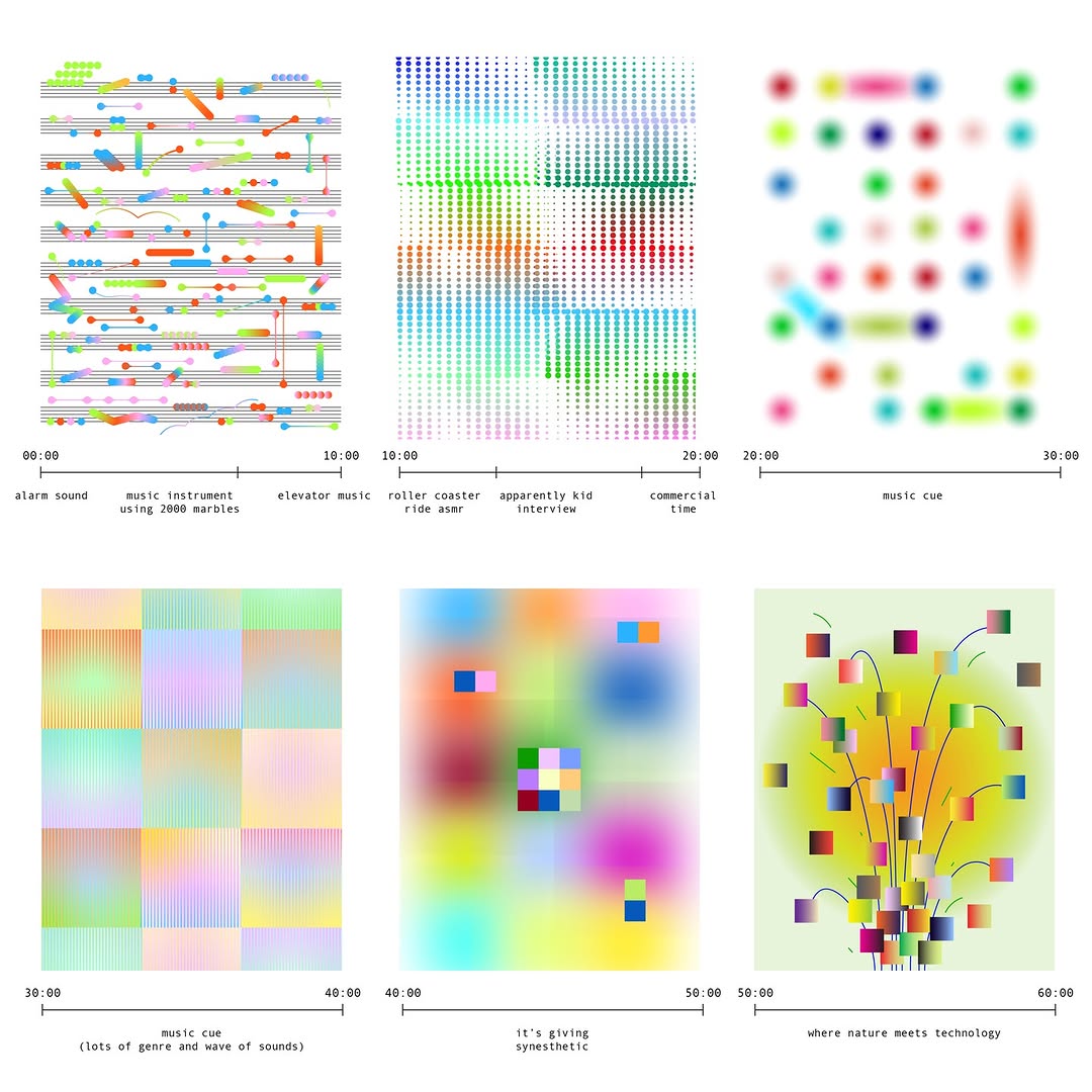
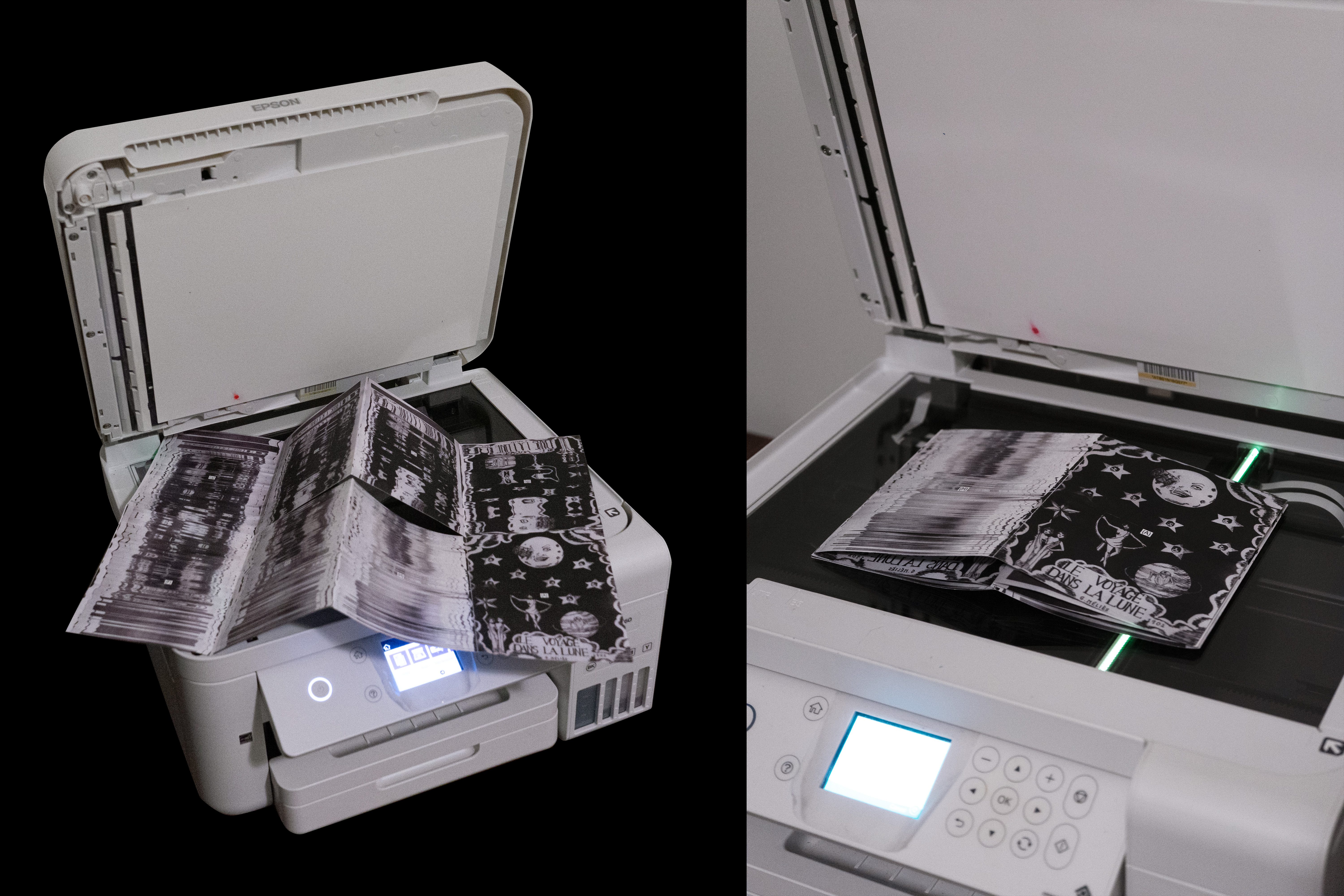
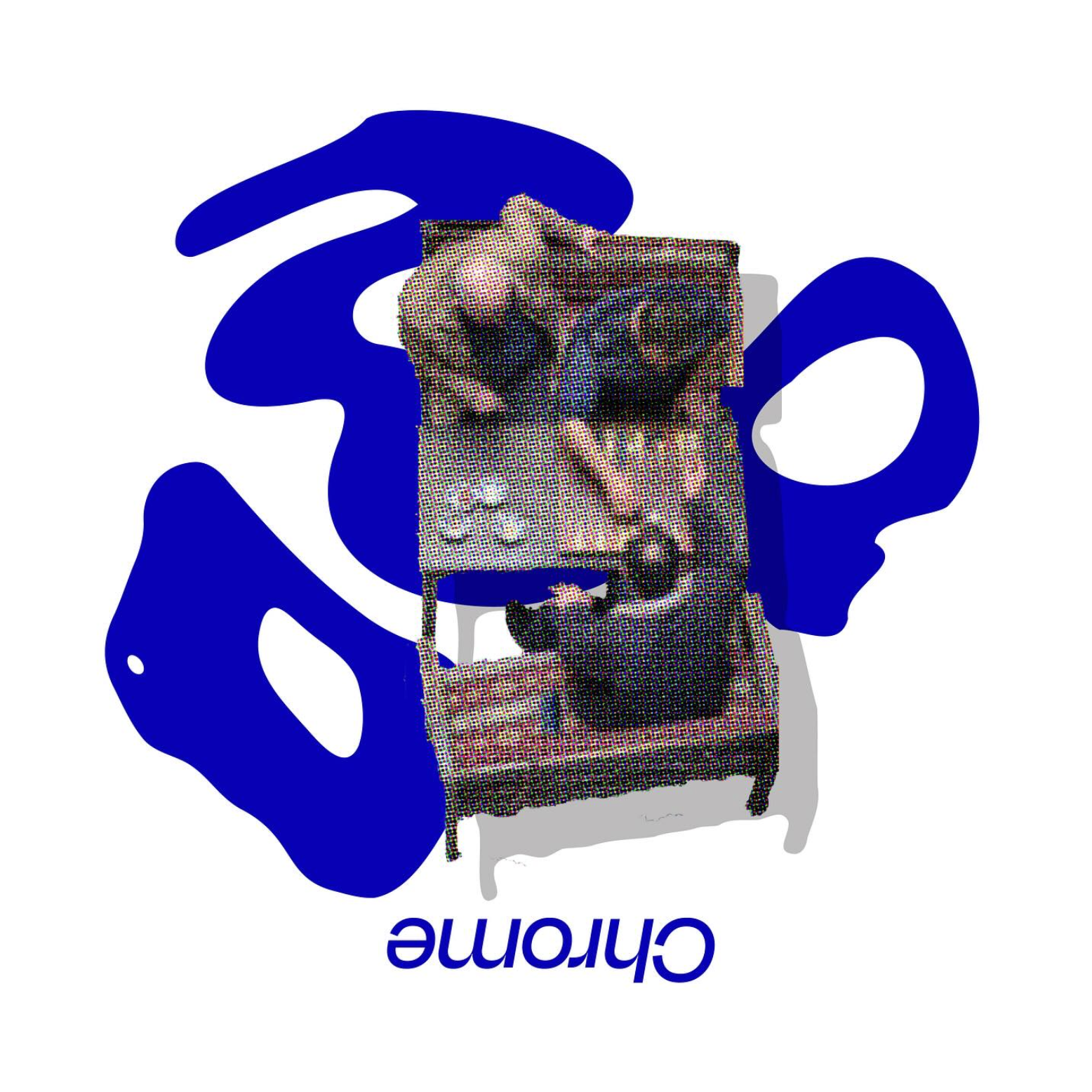
For your final project, you will develop an hour-long radio broadcast alongside a 16+ page printed zine.
This project will help us think about how radio can function as a form of publication, and consider the
relationship between sound and print.
The challenge is to create a meaningful connection between the broadcast and the zine—bridging the gap
between audio and visual storytelling.
Objectives:
→ Explore radio as a form of publication and understand how sound-based media can function alongside
printed matter.
→ Develop conceptual and formal connections between audio and visual storytelling through parallel
broadcast and print artifacts.
→ Plan, produce, and present long-form content that integrates research, sequencing, and audience
experience across multiple media formats.
Tools & Skills:
Audio recording, editing, and sequencing for broadcast, Print layout and publication design, Systems
thinking across time-based and static design formats
Project: Atomic Design
GRDS 256 - Interaction Design
UTK School of Design
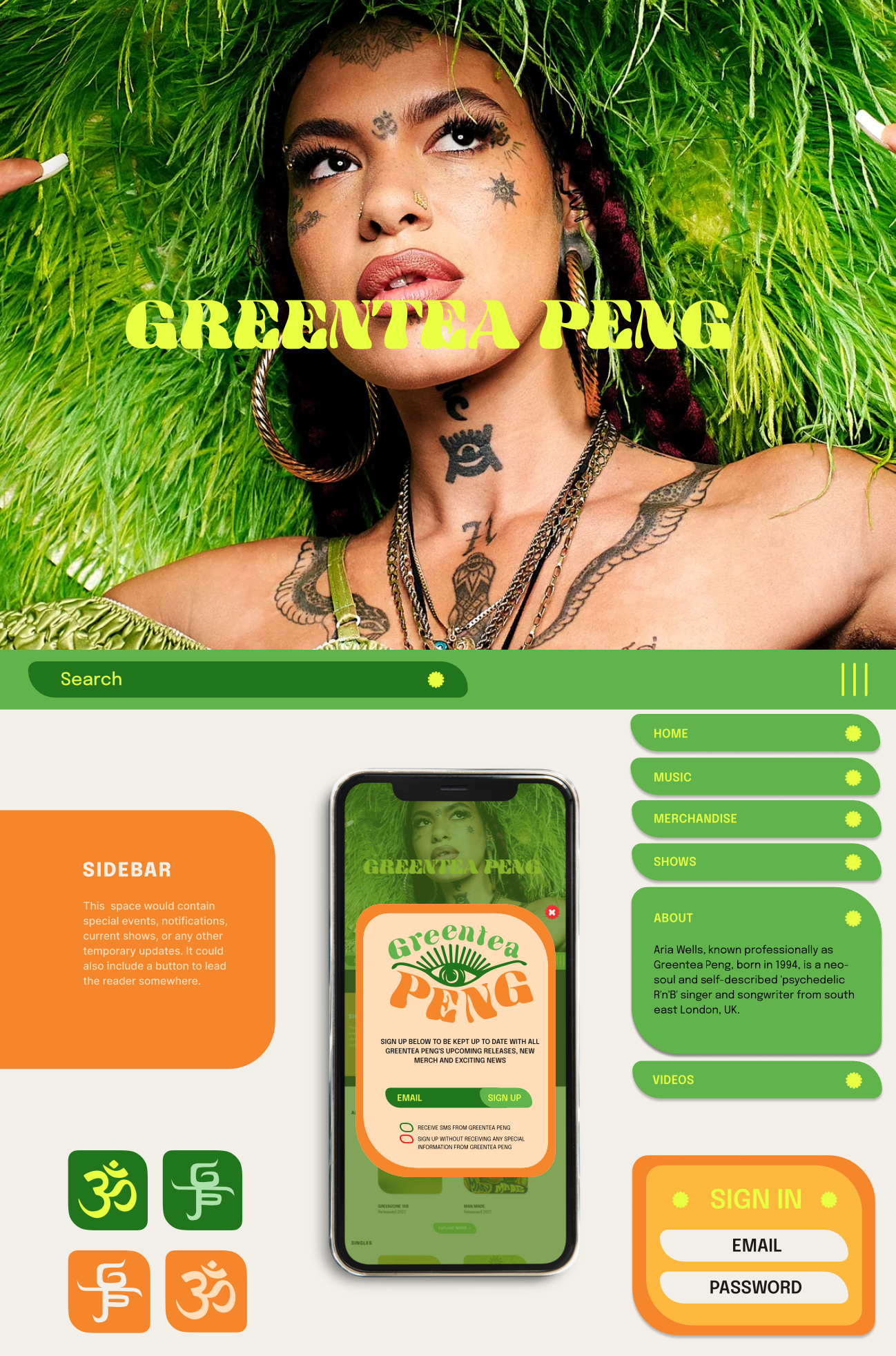
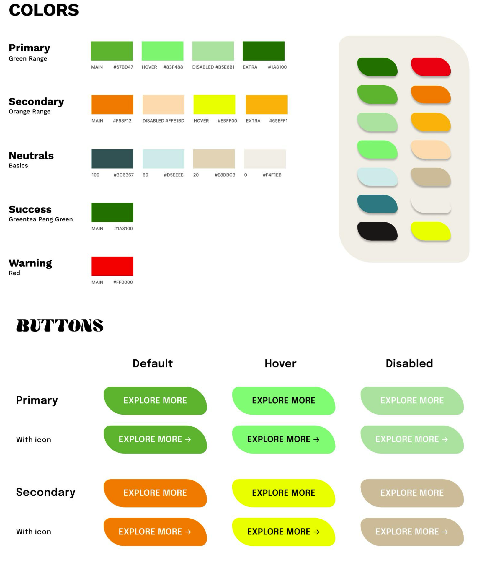
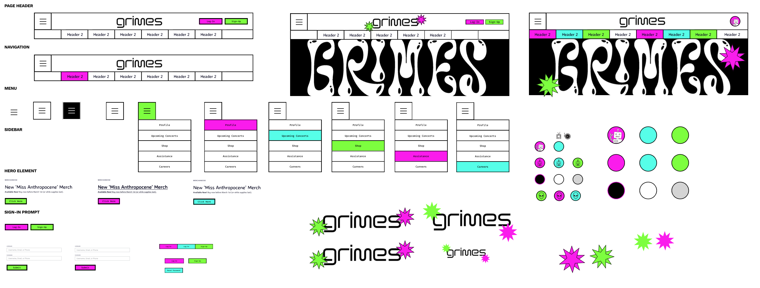
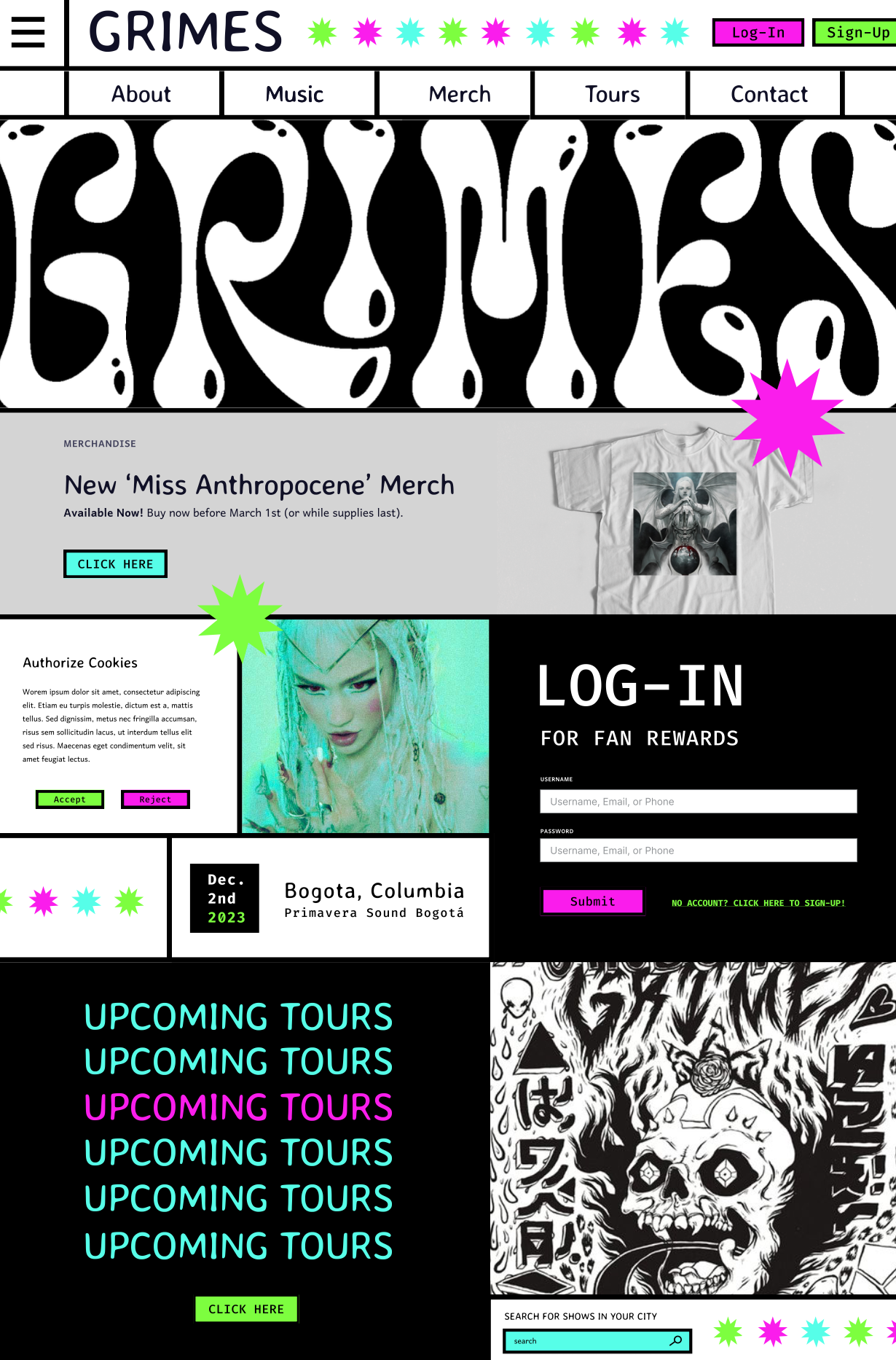
The Atomic Design framework is a strategy for crafting robust design
systems in a methodical, flexible, modular way. You may be asking: what’s a
design system? In a nutshell, a design system is a collection of reusable
components that can be built together to create any digital product.
There are many different ways to approach the creation of a design system.
Atomic Design is one of the methodologies for organizing a design system
that helps make the life of designers and developers easier and their
workflows much more efficient.
In this project, we will be learning the workflow of creating a design system
from the ground up using the Atomic Design method. We will also be
identifying and classifying some essential UI elements, and exploring how
they can be utilized in deliberate ways in order to define the structure, flow,
and look of a digital product.
Objectives:
→ Using the Atomic Design framework, create a design system of unique and discrete elements that can be
combined into deliverable products.
→ Identify examples of successful or interesting UI elements.
→ Explore the process of wireframing.
Tools & Skills:
Figma, Wireframing, User Research, Persona Mapping, Prototyping, Animation, User Flow, Pitch and
Presentation Design
Project: Type Specimen Poster
GRDS 255 - Typography I
UTK School of Design
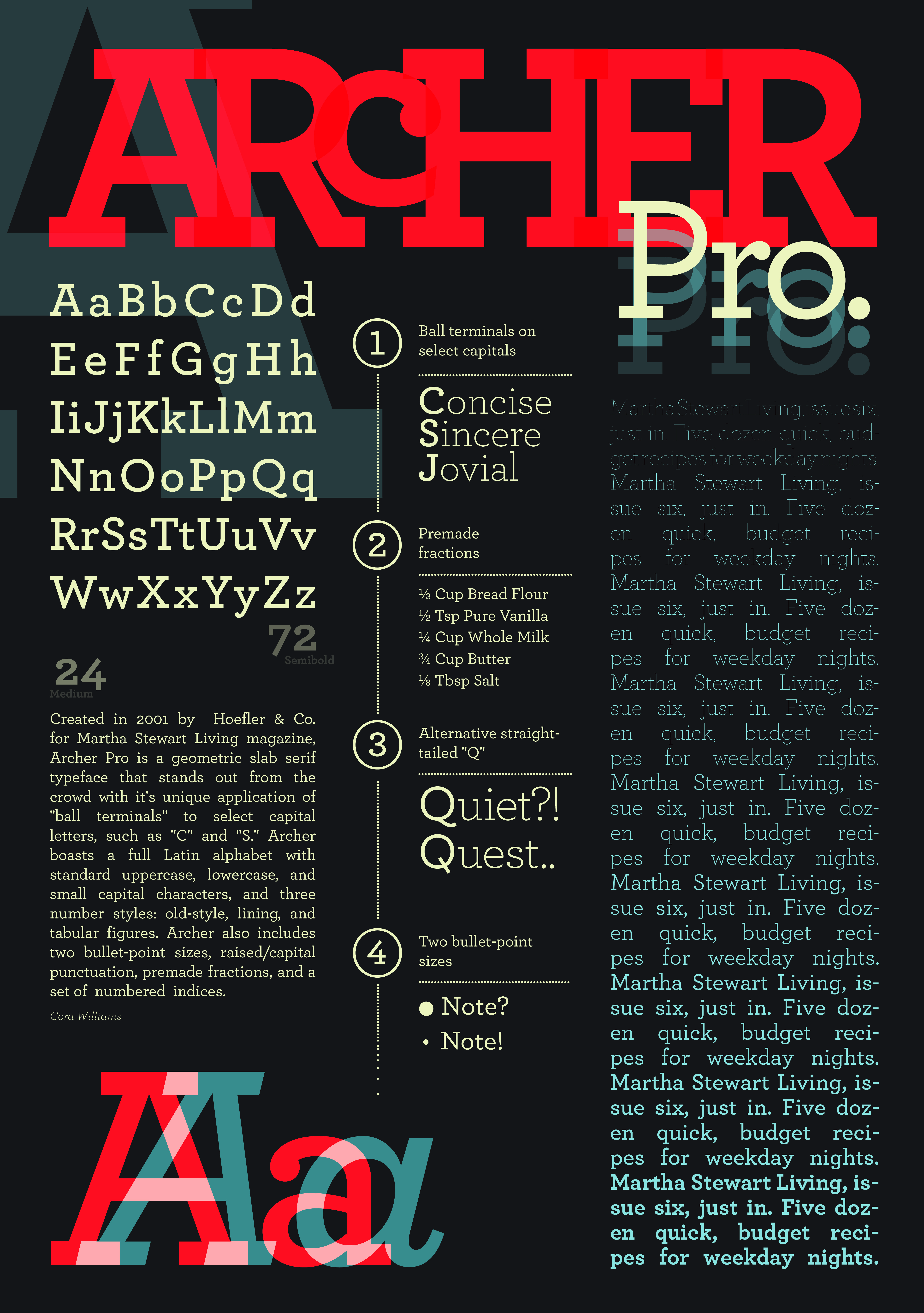
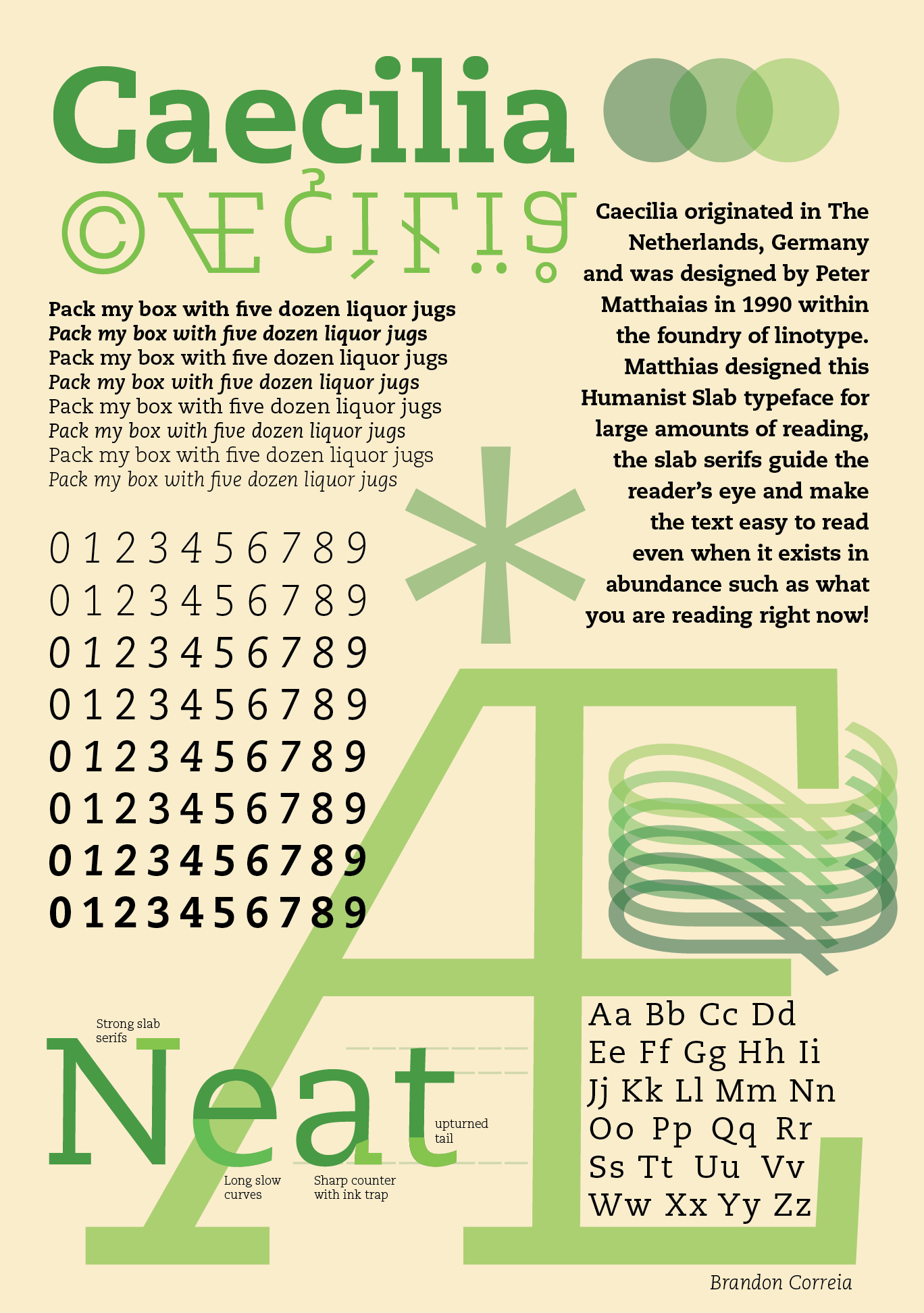
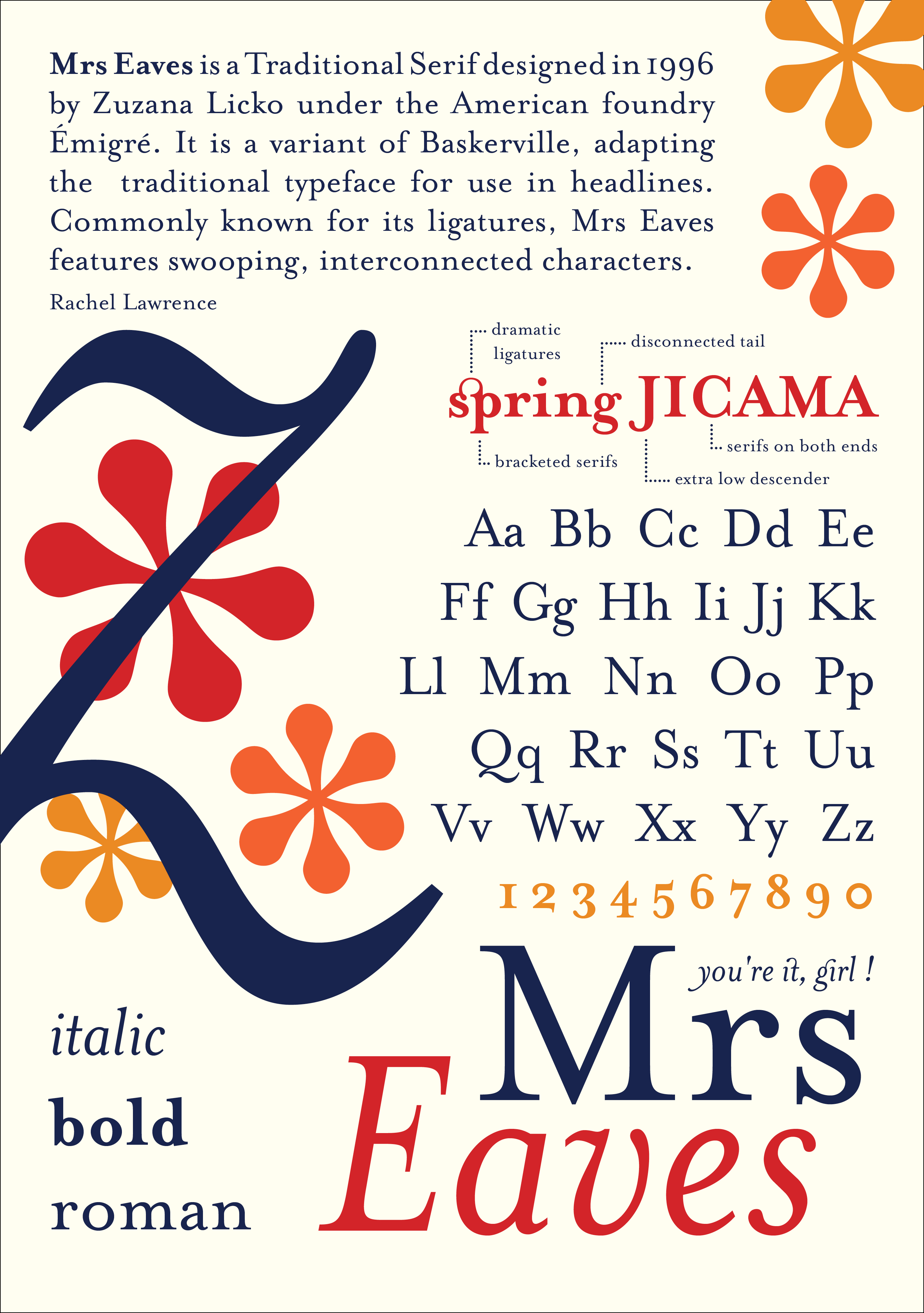
Design and produce a type “specimen” poster for a typeface. A type specimen is a printed design that
demonstrates the range of a typeface, applied to headlines and text in a variety of sizes. Each
variation of the typeface should be labeled on the page. Type specimens have existed for centuries to
help designers pick a font for a project. Type specimens today can be wildly flamboyant or classical in
their approach.
Objectives:
→ Establish and use a simple grid to organize and align elements.
→ Cluster elements to create different typographic densities.
→ Express the nature of the typeface through its overall design.
→ Adjust leading and tracking to create legibility.
→ Compose hierarchy through: emphasis, contrast, balance, repetition,
alignment and flow.
Tools & Skills:
InDesign, Historical Research, Print Production
Project: Movement to a Movement
GRDS 103 - Graphic Design Foundations Studio III
UTK School of Design
Movement to a Movement is a motion design project in which students choose a song and are assigned an
art or design movement (such as Bauhaus, Futurism,
Dada, Surrealism, Constructivism, or Minimalism) to reinterpret as a short animated music video. Through
research and formal analysis, students identify the visual language, conceptual frameworks, and
historical context of their assigned movement and abstract those qualities into motion, typography,
color, rhythm, and pacing.
Rather than focusing on narrative, the project emphasizes sound-driven visual systems and formal
experimentation. Students synchronize animation to audio and explore how time, movement, and repetition
can function as core design elements. The project introduces industry-standard motion design workflows
and positions animation as an extension of graphic design practice.
Objectives:
→ Translate historical and theoretical design movements into contemporary motion design work.
→ Use sound as a structural element to guide timing, rhythm, and motion.
→ Apply foundational animation principles to communicate mood and concept.
→ Utilize transitions to guide us to different scenes of your animation.
Tools & Skills:
Adobe After Effects, Illustrator (asset creation), Audio editing tools, Keyframing and easing,
Storyboarding
Project: Accessibility Zoo
GRDS 256 - Interaction Design
UTK School of Design
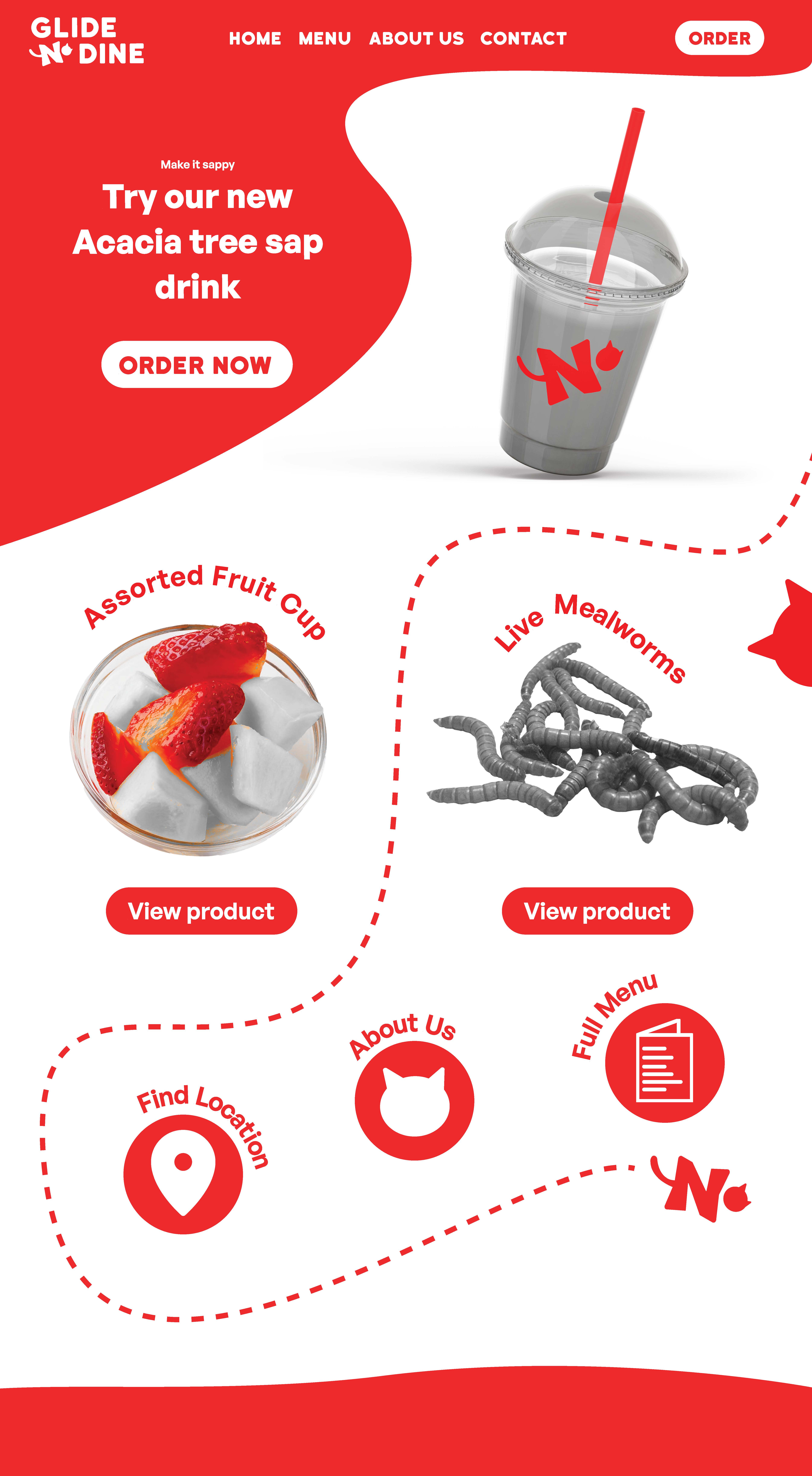
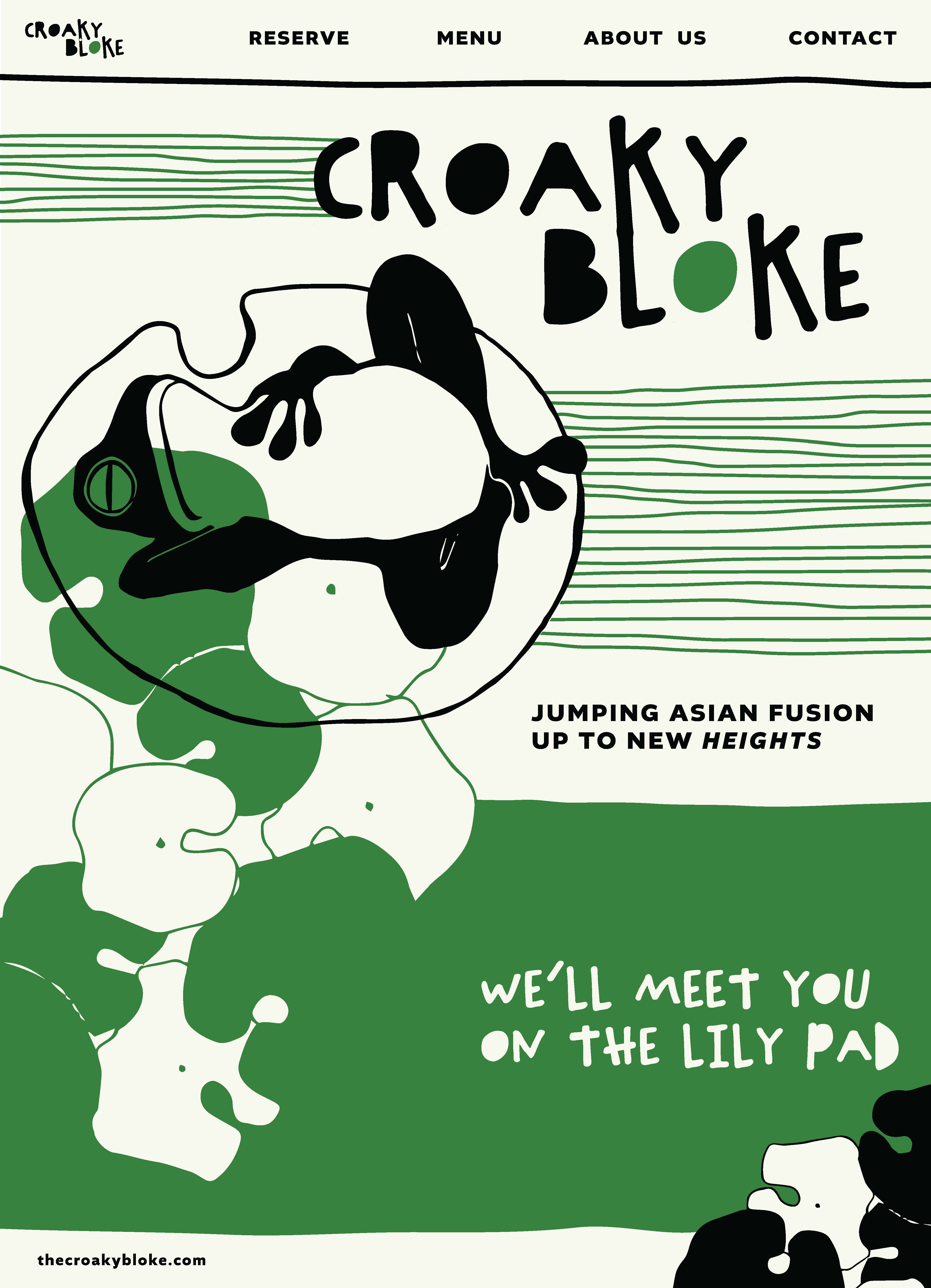
Web accessibility is a critical aspect of web design and development,
focusing on making websites functional for any given user. This concept is
rooted in the belief that everyone, regardless of their physical or cognitive
abilities, should have equal access to information and services available on
the internet. Accessibility is not just a legal requirement but an ethical
imperative. By making accessible websites, designers and developers can
reach a broader audience and make the online world a more inclusive
space.
In this project, we will examine what makes a website accessible, and
(maybe more importantly), what makes a website inaccessible to certain
users. We will learn current accessibility standards, what they mean, and
how they can be applied to a design that is empathetic and plans for
differences between individuals.
Objectives:
→ Use sitemaps to guide website navigation design.
→ Define user personas through UX research.
→ Consider accessibility as a core component to a website design.
Tools & Skills:
Figma, Wireframing, User Research, Persona Mapping, Prototyping, Animation, User Flow, Pitch and
Presentation Design
This space is currently being updated once a season.